Hot and steamy
Testing the Showerdome with UNO’s Steph Taylor
Testing the Showerdome with UNO’s Steph Taylor
There’s always one thing guaranteed on returning home from a visit to our family in Martinborough. You might be thinking more wine in the house, or a bit of laundry to catch up on perhaps? No, no. It’s that for a good couple of weeks my partner Jeff will bang on about how absolutely sensational his parents Showerdome is, and that we need one in our lives ASAP. Every time.
But we come home, and continue showering Showerdome-less under average water pressure, which for me means dancing a fine line between hot and ridiculously burning hot. I dread turning the shower off and getting out! Jeff will often shower with our toddlers and freeze if it’s not his turn under the water. It’s a first world problem for sure, but having experienced how the other half live it clearly toyed with poor Jeffrey’s emotions.
So this winter, our Showerdome dreams finally became a reality! The team were super easy to deal with and the installation was a breeze. Simon came to the house with everything required for a measure up, the dome was cut to size onsite, and installed within a couple of hours under the strict supervision of our three year old. I was really impressed with how straightforward the whole process was, and you can only imagine how fizzed Jeff has been ever since!
In all seriousness though, I've come to realise there are a bunch of benefits in having a Showerdome. Showering is much more pleasant, especially in winter, as all the warmth and steam stays in the shower. I have less hot, shorter showers, and no longer require use of the extractor fan or heat lamps - love this for our power bill. Showerdome makes showering really quiet too, which is great with sleeping babes right next to the bathroom. And when it’s their turn for a shower, they think getting into ‘the dome’ is great fun!
I really rate this Kiwi-owned-and-made brand, and am highly impressed that their product comes with a lifetime guarantee! Check out www.showerdome.co.nz for more information.
Steph - UNO Magazine
Something old, something new
Finding the perfect mix of new and vintage just comes down to filling your interior with things that make you happy, they might spark a memory or tell a story or just feel like “you”.
Finding the perfect mix of new and vintage just comes down to filling your interior with things that make
you happy, they might spark a memory or tell a story or just feel like “you”.
Styling Amber Armitage / Photos Wendy Fenwick @ Flash Studios
Wall colours Resene Paints
Main walls painted in Resene SpaceCote Flat in Resene Cinnamon, through doorway painted in Resene SpaceCote Flat in Resene Twilight, and floor finished in Resene Colorwood in Resene Breathe Easy. Large white pot painted in Resene SpaceCote Flat in Resene Egg Sour. Model 1048 Sunburst table by Stow Davis $8950, Juliane dining chairs for Udlum Mobelfabrik $6750, Norwegian floor lamp by Mejlstrøm Belysning $1450, from Mr Bigglesworthy. Portrait 001 painting by Hey Maker Studio, $949 from Endemic World. French jug $76.50, stoneware crock $75, large stoneware jug $135, from Flotsam & Jetsam. Kinto cast water glass in Amber $24.99, Bordallo Pinheiro Amazonia bowl $79, Diva fork $12.70 each, Diva knife $12.70 each, Live Beautiful book $65, all from Father Rabbit. Together napkin, set of four, $80 from Claire Stapleton. Iittala Teema white plate $39.95, Torino Triangles bowl $589, from Smith and Caughey’s. Karaka merino rug, $1,210 from Baya. Flowers from Urban Flowers.
Stylist tip
Create dynamic interiors by playing with unexpected colour combinations where two spaces meet. Paying attention to these transition spaces can create moments of magic.
Back wall painted in Resene Twilight, right-hand walls painted in Resene Zibibbo, and floor finished in Resene Colorwood Breathe Easy. Wall hook painted in Resene Zibibbo. Monza Bed by Ercol, $2,795 from Good Form. Tobacco Stripes Linen flat sheet $123, Tobacco Stripe Linen pillowcases $64 set of two, Lilac linen pillowcases $64 set of two, Lilac linen duvet, $239, all from Foxtrot Linen. Ida Bolster cushion cover in Mulberry, $69.90 from Citta. Stripe Black cushion, $139 from Father Rabbit. Victorian Rise painting, $75 from Flotsam & Jetsam. Terracotta & Rose painting by Brenda Clews, $950 from Endemic World. Raawii Strøm vase $150, Rosenthal Flux Glass Berry vase $399, Colonna black stool $865, from Smith and Caughey’s. Karaka Merino rug $1210, from Baya. Flowers from Urban Flowers.
Stylist tip
The perfect shade of lilac, Resene Twilight is a pale lilac pink, rosy and suffused with the last sunset. Pair with the depth of Resene Zibibbo, a deep velvety red, for a bedroom palette with a bit of romance.
Left wall painted in Resene SpaceCote Flat in Resene Egg Sour, right wall painted in Resene SpaceCote Flat in Resene Cinnamon, and floor finished in Resene Colorwood in Resene Breathe Easy. Franco Albini Belladonna rattan sofa by Sika Design $3650, Fordite rug by CC-Tapis $16,800, from Good Form. Toledo French market basket $119, from Father Rabbit. Serenade throw $90, Flaxmill Doeskin cushion $140, Cassia Almond cushion $115, Flaxmill Fenugreek cushion $140, all from Baya. Zig Zag stool in lilac and leather $970, Venus mug in lilac $49.95, from Smith and Caughey’s. Two Roads North painting by Lucy Rice, $2,200 from Endemic World. Haven Sheer curtains in Cloud, from $99.99 each, from Curtain Studio.
Main wall painted in Resene SpaceCote Flat in Resene Twilight, and floor finished in Resene Colorwood in Resene Breathe Easy. Artwork on wall created with Resene SpaceCote Flat in Resene Twilight and Resene SpaceCote Flat in Resene Cinnamon. Claremont two door cabinet in black $369.95, Hannah diamond wool blend floor rug $399.95, from Mocka. Tash Swivel chair, $899 from Danske Mobler. Black side table, $299 from Bedpost. Victorian mirror $75, from Flotsam & Jetsam. Senso Zen shoes in ebony, $289 from Father Rabbit. Jonathan Adler Balloon vase $275, Jonathan Adler Porcelain Geisha $435, from Smith and Caughey’s. Flowers from Urban Flowers.
A happy life
The owners of this idyllic country property admit it will be a hard wrench when they finally say goodbye to their home.
The owners of this idyllic country property admit it will be a hard wrench when they finally say goodbye to their home. It has been a haven that has brought immense joy.
Words Jo Ferris
Nestled in the quiet ribbon off Wairoa River, the property feels miles away from reality. Yet, the drive into Bethlehem Town Centre is less than 15 minutes. The vendors fell in love with it the moment they set foot inside. And there is much to love. The home is the initial introduction as electric gates slide open, but this property’s expanse soon reveals so much more.
A huge shed sits in one corner – a three-bay giant with a roller-door division between a double workshop and single garage. The bonus feature is an adjoining office. Formerly a hair salon for the original owners, this suite has a “tea-room” and separate office. Plumbed, and with front-door access, there are various options for this shed and office. Parking is significant – fully sealed by the current owners to offer a mini road that runs from the shed, up to the house and beyond to reveal the next surprise.
A “pool house” cottage nestles in its own little world amid an impressive rockery and trees. Built by the original owners as a temporary dwelling while they developed their dream home, this cottage is a dream in itself, thanks to two key aspects. The swimming pool is a total surprise, but right next door, discreetly tucked within its own corner, is a hot-water outdoor bath. Serene by day, fairy lights turn this entire nature pocket into a magical wonderland at night.
Operating as a successful Airbnb, this two-bedroom cottage is an absolute charmer. Future owners could continue this as an income-based operation, but it’s an obvious invitation for extended family. With the shedding and this pool house, there’s endless opportunity for families to share life and business together, while enjoying personal privacy.
The main house is a stand-out. A home that has been all things to this family. A place where major family gatherings and grandchildren’s parties have been held. Easy to see why, given all the playground space and spa pool. This home’s warm greeting is instant. No need for the formality of a foyer; the open-plan design welcomes with open arms.
Polished concrete flooring is not only aesthetically beautiful, it’s practical and useful. Heated, and on a timer,
it warms the toes in the morning. By afternoon, glazing harnesses solar warmth. The gas fire is rarely turned
on. But it makes a grand statement. The other striking element is a feature wall. Stack-bonded concrete bricks make a dramatic background for artwork – especially when spot-lit from above for theatrical mood.
A gourmet kitchen and scullery cater for big gatherings, including a second dishwasher and sink in the scullery. Stainless steel on the cooking station is a cook’s dream and the bar-stool interacts brilliantly with the dining setting and sheltered lounge outside. This suntrap café is a gem – its cosiness enhanced by a gas fire that links back-to-back with the fireplace inside. An invitation to start the day with a cuppa in the sun, this corner is brilliant in the afternoon as the sun starts to set. Three bedrooms downstairs share a huge bathroom with a signature rainfall fixture, while the parent retreat basks in privacy upstairs. This is five-star intimacy with a hotel-style bedroom, walk-in wardrobe and another designer bathroom.
At one with nature, birdsong and a myriad of fruits to feast on, this property nurtures the soul with its serenity. Hard to leave, but Wanaka beckons – allowing another chapter to begin in this extraordinary country property.
21 Vernon Road, Wairoa
For the love of linen
Opening soon in Tauranga, the global Kiwi bed linen brand MM Linen will bring their unique signature style to the Bay.
Opening soon in Tauranga, the global Kiwi bed linen brand MM Linen will bring their
unique signature style to the Bay.
Words Monique Balvert-O’Connor
Australia, USA, South Africa, UK, the UAE, and now the Bay has become part of the ever-expanding success story that is MM Linen, with this quality bed linen and homewares brand about to open up shop in Tauranga’s city centre.
Kerry Jackson, the company’s co-founder and creative director, has been selling in stores around the world since launching MM Linen about 10 years ago. The company has been on a steady growth trajectory ever since, and is now stocked in about 700 stores in New Zealand, Australia, UK, the USA, South Africa, Israel, Canada and the United Arab Emirates. There’s impressive pedigree among those stores – think major British multinational retailer Marks and Spencer and high-end department store chain John Lewis.
Within eight weeks of launching in Marks and Spencer three months ago, MM Linen was one of their top home linen brands. In addition, it’s been ranked within the top five ever since launching at John Lewis three years ago. The brand also has a strong presence across the Tasman in Myer.
With that impressive global reach sorted, this entrepreneurial Christchurch-based businesswoman turned to store ownership in New Zealand. In recent years she has opened two stores – Auckland in June 2020, and Christchurch in August last year where their head office is also based. Now it’s Tauranga’s turn, with MM Linen opening in the Eleventh Ave shopping precinct on May 5.
For Kerry, watching her business grow has been exhilarating. “I just love being my own boss, and I’m proud it’s a New Zealand homegrown company focused on treading lightly on our environment.
“I love the opportunity to be creative and hands-on, and to be in control of my own destiny,” she says.
Destiny’s path took a bit of an about turn for Kerry back in 2012 when she had just turned 50. With an unexpected change in her career direction, and a determination to remain in Christchurch, she decided to start her own business. This was with the backing of her business partner, a textile manufacturer based in the UK.
It took merely two years for MM Linen to become a global enterprise, soon to gain a reputation for beautifully fitting out bedrooms across the world. Kerry says having original designs created from scratch by artists gives her company an edge in the extremely competitive home linen market. She’s also proud to add that MM Linen has been operating as a carbon-neutral company for years.
Kerry tells how MM Linen has always had a strong customer following from the Bay of Plenty area.
“Lots of BOP people visit our Auckland flagship and Christchurch stores and buy through stockists (Dillimore’s in Waihi being one of them, and previously Cabbages and Kings). So many people say, ‘When are you coming to Tauranga?’ I feel there is a real gap, a space for a beautiful bed linen store in Tauranga,
so we’re coming!”
A personal connection with the city has long been forged. Kerry’s husband is from the Bay and her parents lived in Omokoroa for 15 years.
“So, I frequented the stores in Tauranga with my mother during regular visits – Wendy’s, opposite our new store, being one of them. I think there will be good synergy between my store and Wendy’s, so the location is key,” enthuses Kerry, who professes to having a very flamboyant fashion sense. It’s colourful and botanical, and that’s what she uses as inspiration for her bedding range.
It’s exciting, she says, to be at the stage whereby her business is growing a New Zealand presence, and Tauranga is a good fit for MM Linen’s signature botanical print.
“Our brand is really inspired by nature and botanicals and Tauranga is a drawcard – with beaches, sunshine
and enjoyment of the great outdoors,” says Kerry, who personally curates her range along with the team at its head office. There, a small team of six can be found, and the company has designers in Australia, France, Israel, and the UK as well as New Zealand.
This year brings a new chapter for MM Linen. Tauranga shoppers can expect their MM Linen store to be a boutique destination, housing bed linen (textures, plains and botanical prints), a wide cushion selection, throws, aprons, tea towels, printed mugs, bean bags, and a designer home scent and body range (diffusers and hand creams etc) imported from Italy.
The success story is set to continue.
Tapping into trends
Harrison Bloy just opened their first North Island showroom in Tauranga, and now proudly provides high-quality products to bathrooms around the Bay.
Harrison Bloy just opened their first North Island showroom in Tauranga, and now proudly provides high-quality products to bathrooms around the Bay.
Words Nicky Adams | Photos Jahl Marshall
The bathroom is a room that is overarchingly functional – however, it is also a space that makes one of the biggest interior design statements. It is a room that needs to be designed for longevity, practicality and visual impact – but also one that every family member will spend time in. When working out the design direction you want to take amid the current looks, there is no better place to find inspiration than in a physical showroom.
Harrison Bloy is a privately owned New Zealand bathroom (and kitchen/laundry plumbing) supplier that, while well-established throughout the South Island, has recently chosen to open its first North Island showroom in Tauranga. The decision to move to Matakokiri Drive in Tauriko, says co-owner Callum Harrison, was largely driven by the desire to be closer to family up here. However, he and business partner Ben Bloy had also identified the exponential growth in the Lakes area, with huge potential growth to come in Tauriko.
Harrison Bloy considers it important to offer a wide spectrum of brands and products not just in terms of style, but also price points. In addition to the other familiar quality brands available in New Zealand, it also supplies Watersino, a well-known worldwide brand unique in New Zealand to Harrison Bloy. Callum is passionate about the service they can provide at Harrison Bloy: “We have top of the line, but we like to think that we’re experts in bathroom fittings and it’s not just another bathroom shop − it’s actually advice, design and top-quality gear on display.” The interactive nature of the showroom is something the company is proud of: “There’s a working toilet (with a heated seat!) over there, working gas fires here.” The pièce de résistance, though, is the “wet area”, where customers can pick from multiple shower heads to try out for themselves. Equally, the stylish bathroom pods have been designed to give a visual concept of different looks – placing key components in individual settings. Another clever feature is the way in which tapware, rather than being fixed on display, can be moved around and placed with different basins – the basins themselves can also be interchanged. These are all hugely helpful parts of the process when trying to work out the best combination for personal taste.
The showroom itself is large, thoughtfully designed and allows customers to organically move among the products on display. The range is extensive, and starts at a lower price point, moving up to higher-end, more bespoke pieces. Here customers will find a selection they hitherto may have expected to travel further afield to access. With a hugely experienced team to filter what is showcased, the customer is saved from a product overload – and can be confident what is here is a selection of high quality, on trend pieces, that will help make the ultimate bathroom.
Zucchetti is a well-established Italian premium tapware brand stocked by Harrison Bloy in all its showrooms. Robertson Bathware general manager of architecture and design, Dean Davis (New Zealand supplier of Zucchetti), reflects on the direction Harrison Bloy has taken, commenting, “It’s a credit to Harrison Bloy to want to take retail to the next level. It’s really refreshing in both its design and to the market.” Zucchetti is a family-owned and run business that was established nearly a century ago; now led by the third generation, Zucchetti prides itself on the way it has evolved, and indeed anticipation leads the direction of market trends.
Zucchetti has always invested heavily in the design aspect of its products alongside exceptional performance. While the overall aesthetic of a bathroom (or kitchen) will be dictated by multiple factors, increasingly interior designers are looking to the “work horse” pieces, such as the fittings, to make a statement. Zucchetti has set itself apart from other brands in this arena. With a focus on being an architectural led brand, Zucchetti employs a team of international designers whose award-winning ranges reflect the calibre of their skill. As Dean says, “One of the point of differences that Zucchetti offers is that they employ international and innovative designers to create each collection.” Zucchetti is also proud of the symbiotic relationship with the designers themselves; the Medameda range was created by a father-and-son design duo, Alberto and Francesco Meda.
With the overall aesthetic of a bathroom both elevated and unified by the fittings, it’s no surprise that there are distinct trends within tapware. Currently, Dean says, there is an increase of the gooseneck spouts, and softer, rounder shapes are more popular. Driven by the European trends, the curvier shape doesn’t date so quickly. There is a clear leaning towards Stainless Steel, which is considered both durable and eco- sustainable; tie this in with the lack of lead in its production and it will continue to be a market leader. Dean feels another area of strength for Zucchetti is its breadth of options – most designs come in six or seven colourways and, importantly, provide matching accessories such as toilet paper holders, basin wastes, shower hooks and so on.
While design is key, functionality is vital – clients expect longevity from these types of pieces. Zucchetti stands by a good warranty along with other practical aspects such as good efficiency on water flow. Continually seeking exciting developments, this can be seen in ranges such as the new Isy22 – a progressive mixer with infrared options, in which the water flows from cold to hot. This means that should a child, for example, turn on the tap, they won’t be scalded by extreme heat.
Implicit to its ethos is a drive to be ahead of the curve, and Zucchetti prides itself on an innovative attitude towards the link between design and purpose. It believes its products not only offer exceptional performance, but also elevate and unify the overall aesthetic of any space within which they are placed.
Harrisonbloy.co.nz
Bathroom tips to stay on-trend
Add a customised piece
Use the bath as a focal point
Coordinate all bathroom products with a full range of accessories
Round shapes are popular – also products with a balanced size
Refresh rather than remodel by changing your vanity unit
Go for lighter tones like beige and pink, with warmer woods
Scandinavian style meets Japanese influence is cool and current
Circus Stripes
Being bold with thick stripes and a fun colour palette can bring so much life into a space, while still looking sophisticated.
Being bold with thick stripes and a fun colour palette can bring
so much life into a space, while still looking sophisticated.
Styling Amber Armitage | Photos Wendy Fenwick @ Flash Studios
Wall colours Resene Paints
Walls painted in Resene Half Sea Fog with stripes in Resene Scoria. Floor painted in Resene Athena. Elusive Forms 2, 1120 x 1220mm, 2021, by Clare Brodie, $7950. T1 armchair by OMK $2295. Flask vase, $170, footed planter, $85, both by Gidon Bing. Cape chair in Boucle by Warm Nordic, $4150, from Good Form. Tam Tam stool, $609, Jay Kirby vase, $110 and Lolly short table lamp, $839, all from Smith + Caughey’s. Humla coffee table, $1795, from Bauhaus. Al Fresco book, $79.99, and Kitchen Living book, $120, both from Father Rabbit. Beau wool blend floor rug, $699.95, from Mocka.
Stylist tip
For a fun, modern take on the classic stripe, go bold and wide. Adapt the classic bright red to the more sophisticated deep brown-red of Resene Scoria. When using a bold thick stripe try to follow
this look through with chunky furniture pieces that will make a statement.
Left wall painted in Resene Half Sea Fog with Resene Scoria stripes, back wall painted in Resene Half Sea Fog. Right hand wall and floor painted in Resene Athena. Striped lamp (stylist's own) painted in
Resene New Day. Be My Guest sideboard, $5450, from Good Form. Broste Copenhagen wide pond pouf, $1835, and pleated frill vase, $205, both from Smith and Caughey’s. Straight-sided vessel, $55, white Mode wave bowl, $119, Simplicity at Home book $59.99, Ghosts of Gondwana book, $59.99, Flower Market winter blue framed print, $659, The New Yorker basket, $99, all from Father Rabbit.
Back wall painted in Resene New Day, left wall in The Surround by Laminex panels demi round, painted in Resene Morning Haze. Floor finished in Resene Colorwood Breathe Easy. Opal Shade Pendant Lamp by Svend Aage Holm-Sorensen, $895, Chiara Corbeletto Quadriligia rug for Dilana, $6720, from Good Form. Diamond-shaped solid oak dining table by Jon Jansen, $2195, Maple Furnishing Co. dining chairs, $3450, from Mr. Bigglesworthy. Tam Tam Stool, $609, small dual vase, $239, all from Smith and Caughey’s. Al Fresco book, $79.99, Beldi glass jug, $85, Beldi wine glass, $15.50, Primitif white pitcher, $89, shallow basket, $40, all from Father Rabbit.
Stylist tip
Carry through the idea of "stripes" into other areas of the home with a striped lamp and the inclusion of The Surround Laminex panels on the wall. These will help bring all the spaces together.
Left wall in Resene New Day, back wall covered in The Surround
by Laminex panels demi round, painted in Resene Morning Haze.
Floor finished in Resene Colorwood Breathe Easy. Effortless Hans
Olsen ‘Model 563’ sofa by Brdr. Juul Kristensen, $5250, from
Mr. Bigglesworthy. Relate side table, $1049, Glide low stool, $625,
from Bauhaus. Beldi wine glass, $15.99, La Tribe Thin Elke sandal, $269.90, from Father Rabbit. Karaka rug in Merino, $1210, Cassia Tobacco cushion, $115, Indira cushion in natural, $110, from Baya.
Stylist tip
Creating a bold colour palette can be a daunting task. Opt for at least two to three mid tones that are very similar in colour, to give you small variations, but hold the palette together (Resene New Day, Resene Morning Haze, Resene Athena). Include a white with base tones that compliment these (Resene Half Sea Fog) and a deep bold contrasting colour (Resene Scoria).
Test pots and A4 drawdown paint swatches (from top) in Resene Half Sea Fog, Resene Athena, Resene New Day, Resene Morning Haze and Resene Scoria.
It takes a village
If you’re looking for a more relaxed-yet-refined way of life,
Althorp Village may be just the right place to call home.
If you’re looking for a more relaxed-yet-refined way of life,
Althorp Village may be just the right place to call home.
Words Monique Balvert-O’Connor Photos Jahl Marshall
Given its top-notch appearance, the facilities and all that’s on offer (more than 30 activities a week, from choir to aqua aerobics), it’s not surprising Althorp Village has a holiday resort ambience.
With well-thought-out recreational facilities and architecturally designed dwellings, accentuated by stunning gardens and an expansive park-like setting, the retirement village combines resort-style amenities with high-quality homes. There are impressive outdoor facilities too – think lawn bowls, croquet, tennis and garden allotments (there’s even a hobby shed).
Althorp Village manager Claire Keen says the village residents enjoy the opportunities offered, as well as embracing independent living and organising their own groups and events.
“Our vision is to create an environment where our residents can find like-minded people and where they can be happy and enjoy their golden years, stress and trouble free.”
Set across more than 12 hectares, this premier residential village for seniors has two apartment blocks. The Lodge offers a range of one, two and three-bedroom apartments and The Garden Apartments are all large north facing two-bedroom, two-bathroom apartments. There are 211 different properties on site including a motel.
The Althorp Village philosophy promotes the idea of residents staying in their own homes for as long as possible and with as much help as required. “It’s a happy balance between keeping a close eye on how everyone is doing without being intrusive,” Claire says.
“We are an independent living village – every level of care is available if, and when, required. Our residents can go from an independent apartment or villa to serviced apartments and then on to Radius Althorp Hospital if required. The hospital includes rest home level beds, respite care beds and geriatric care,” she explains.
Currently available is the opportunity to buy a license to occupy a two-bedroom apartment in The Garden Apartment Block, and a three-bedroom apartment in The Lodge apartment block.
Garden apartments have two bedrooms, a large ensuite plus a guest bathroom. They are north-facing and at ground level, opening out onto a large patio, beyond which are the much-admired gardens. These apartments enjoy spacious open-plan main living, underfloor heating throughout, a separate laundry and excellent storage. Parking is secure and undercover, with a large storage cupboard included.
Lodge Apartment 8 captures lots of sun, features three bedrooms, ensuite and main bathroom, and an open plan kitchen, dining and lounge. This apartment is on the second floor and overlooks the village gardens. The large deck is a lovely spot where you can bask in the afternoon sun. There is underground parking and storage. The apartment is accessed via the village’s atrium area – a popular enclosed space, flooded with light. It’s but a hop, skip, and jump from this apartment to many of the indoor activities on offer. Housed in the building are, for example, the indoor heated pool, gymnasium, spa, movie theatre, bar, library, games room, dining and lounge areas.
Claire and team also stress that its important for families to know we have a friendly and caring community of residents. The Althorp Team is also aware the aging process for families can often be daunting and its important for family members to know we can guide them to whatever levels of support are required.
Claire says the opportunity to buy a Licence to Occupy at Althorp Village is an exciting one as they don’t come up very often and there is usually a waiting list.
Zen by design
East meets west in this stunning home’s Japanese-inspired aesthetic.
East meets west in this stunning home’s Japanese-inspired aesthetic.
Words Jo Ferris
This Mount Maunganui home’s dramatic street-front greeting showcases a striking look born in Japan. Yakisugi’s authentic process of charring sugi cedar not only improves the timber’s life span, it adds another layer to this home’s haunting story.
It’s a story of evolvement – from this home’s birth in 1956 to a stunning epitome of the Mount’s coastal vibe.
The weatherboard construction remains, but that’s about all. Over the years, different owners have embedded their own mark. The vivid allure of black, vertical shiplap on walls curving around this home’s lower area are a fitting imprint by these vendors.
Stunning aesthetics aside, two hidden elements enhance this driveway’s function. Power in one corner offers
a charge point for vehicles and parking for a motorhome. A gas point in a recess allows for the addition of screen doors to hide bottles and utility bins.
The garage is another improvement by these owners. Lined over block, carpeted and finished with extra detail, it is now a multi-purpose zone. An internal stairwell leads up to the first level. For visitors, the
sugi-clad steps sweep up through a coastal-themed garden, where resident tuis haunt the pōhutukawa. They’re so frequent and familiar, these owners have even named them.
Other than original native timber flooring throughout the home, the décor was completely transformed by prior owners.
One intriguing feature pays homage to the construction. A distressed weather-board panel hanging on a passage wall as a work of art, is actually a disguise for the hot water cylinder behind.
Apart from one original window in the master bedroom, joinery was replaced with double-glazed aluminium. Plywood is a statement element that instils tone and texture in key areas. Feature walls showcase ply’s natural blonde finish, while black negative detailing makes a striking effect in-between the panels. Kitchen cabinetry is finished in laminated plywood, while timeless stainless steel benches are a practical surface cooks will appreciate.
Open-plan living and outdoor flow maximises space to connect with areas outside. A morning balcony at the front gazes out to sea. At the rear, there’s an intimate link with a secluded backyard oasis. The third bedroom also opens out to this sun deck and shelter from afternoon breeze within this tropical sanctuary. It’s an easy-care garden – with a corner for veges and a hidden sink bench for filleting fish.
The master bedroom commands the front-row ocean view. A second living area above, elevates this to a grandstand coastal outlook. With glimpses to three islands, Motiti sits directly in front and waves can be seen lapping on the beach. This is a spacious, multi-purpose zone – an invitation for leisure or work. With sun streaming inside, an air conditioning unit keeps life cool in hot weather. There are two more heat pumps elsewhere, plus a wood burner. Highly efficient, it’s another feature which matches this home’s distinctive vibe.
Within walking distance to the beach and cafes, this impressive home awaits another chapter. Inspection is invited, and more information is available on Oliver Road Real Estate’s website.
Bringing Bali home
Landmark Bay of Plenty’s latest show home combines tropical-inspired landscaping with relaxed, resort-like living.
Landmark Bay of Plenty’s latest show home combines tropical-inspired landscaping with relaxed, resort-like living.
Words Monique Balvert-O’Connor Photos supplied
It’s another passion project, says Carly Stewart of the latest Landmark showhome that’s just opened its doors in Palm Springs, Papamoa.
Carly, who co-owns Landmark Bay of Plenty with husband Logan Stewart, admits she’s fallen in love with the house, just as she did with her company’s previous show home in Omokoroa’s Harbour Ridge.
In true Landmark Bay of Plenty style, this latest beauty, sited in Montiicola Drive, is two-storied and clad in weatherboard. But, while the Omokoroa show home was Hamptons themed, this one represents Bali at its best - Balinese luxe resort to be exact, says Carly. This time, she was determined to take “a sidestep” and create something slightly different from the many coastal-themed abodes on the Montiicola strip.
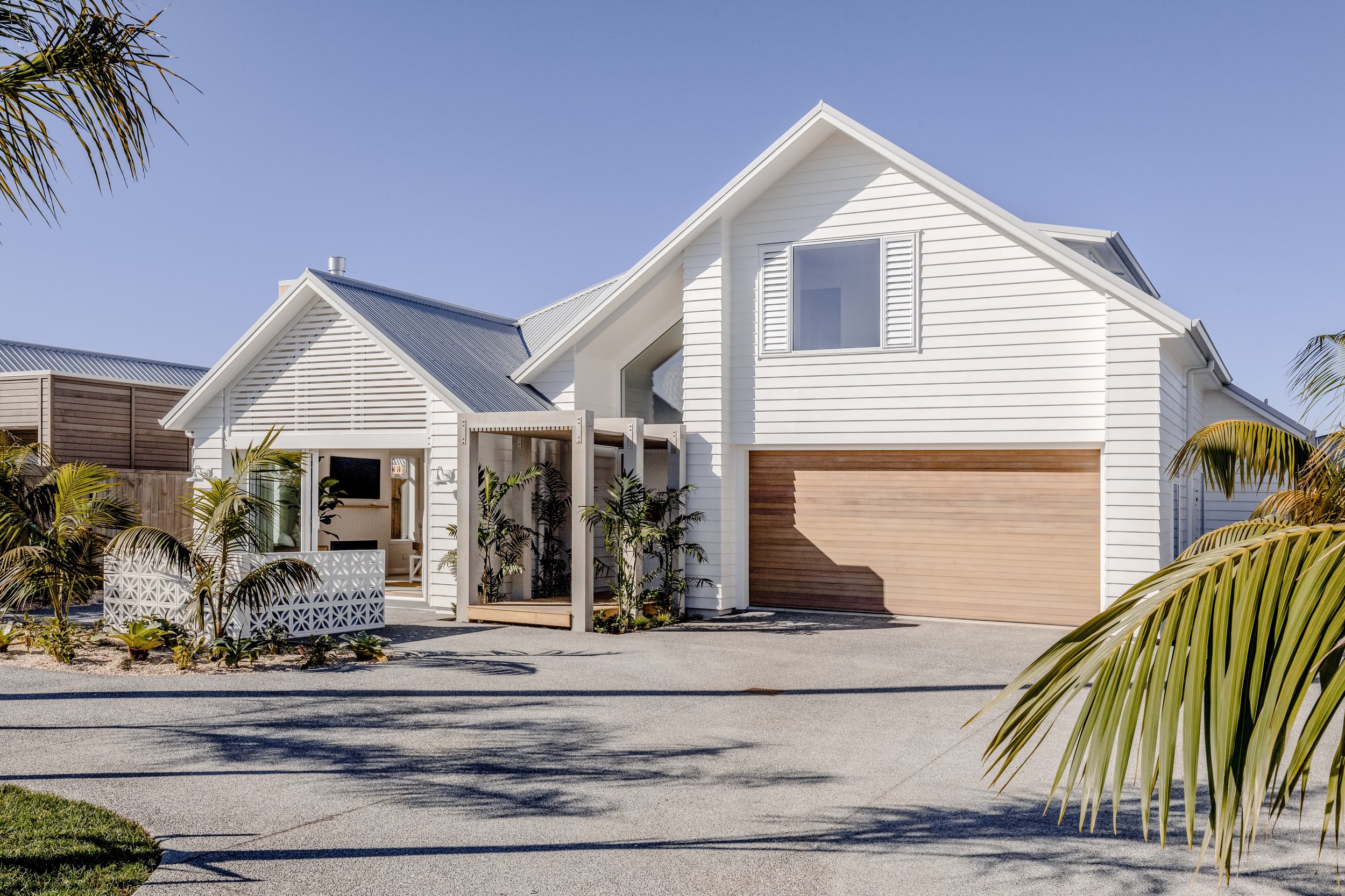
Tropical planting is an early indicator of the Balinese theme, and the James Hardy white-painted linear weatherboard (in Resene Quarter Rice Cake) has been joined on the exterior by blonded cedar detailing. The cedar aspects add to the home’s cutting-edge contemporary look, Carly explains, and it was important that the cedar was bleached (a Dryden wood oil was used to achieve this) to suit the light and breezy Balinese look. Also in accordance with that look is the pergola leading to the front door. It’s topped with narrow timber slats while bamboo grows at its sides. The white breeze block wall nearby features a frangipani design.
A family home, this build spans 220 square metres, with the downstairs dedicated to open-plan main living (including a spacious scullery that incorporates a sink and wine fridge), the master bedroom suite, and a powder room. There is a separate laundry and internal access to the double garage. Accessing the outdoors is a breeze, as one would expect of a home channelling many things Balinese. A large timber deck feeds off the dining and living rooms where the doors stack back to integrate the inside and outside. There’s a patio off the master bedroom and a second patio off the lounge, facing roadside. This patio’s outdoor fire (there’s a gas fire inside, too), built-in cooking facility, breeze blocks, and plantings (including palms and cycads) amp up the home’s street appeal.
Carly and Logan were especially keen for this home to be two-storied, as the upper levels offer the opportunity to enjoy sunset views over the Papamoa hills. The stairwell, rising from the entranceway of the home, leads to two double-sized bedrooms, a family bathroom, and a small lounge/retreat that can also function as a study space.
The wonderfully functional layout and exterior appeal is complemented by the beauty in the detailing throughout the home. Carly so loves dealing with this aspect and calls upon interior designer Roselle Blockley of La Belle Maison to assist as an excellent sounding board. Carly sources product with the wow factor and turns her hopes and dreams into reality.
Excellent décor decisions are immediately apparent. The light fitting in the stairwell void is a handcrafted circular stunner – a visual treat that can be enjoyed from outside the house, too, given the window over the front door follows the roof’s high pitch. Also pleasing the eye from the get-go is the view from the front door of the stairway’s American Oak slatted balustrade (to bring the natural timber through to the inside), and a feature wall of handmade seagrass wallpaper.
Carly has ensured the build includes naturally derived product where possible. Sustainable, natural fibres were to the fore, for example, when the carpet was chosen – they’ve gone for Bremworth wool loop pile – and Roselle’s sourced natural organic linen for the drapery throughout the house. This environmentally friendly approach applies outside, too, where a water bore has been installed to keep the gardens lush year-round.
This showhome’s name promises luxury and a resort-like ambience so, as expected, there are many aspects that look fabulous and speak of enjoyable living. Top of mind for Carly are inclusions such as the large, round skylight inserted in the rooftop over the expansive deck; Forte timber flooring laid in a herringbone pattern in the lounge room; and “the most divine, opalescent tiles” from Sydney in the bathrooms’ shower recesses. Then there’s the kitchen where, in place of a splashback, there’s a window looking out on one of the patios with its lush planting – and then there’s the outdoor shower.
“It’s a Balinese resort-inspired shower – it will be like standing in a tropical garden, with planting around and reached via misshapen glacial schist stepping stones in among a crushed shell path,” Carly enthuses.
The comprehensive landscaping plan, feature walls of wallpaper and tongue-and-groove timber, custom-made cabinetry, American Oak features, brushed nickel tapware, the high raked ceiling… All this and more give Carly joy when she views this latest show home.
Already sumptuous, there’s the potential to make it even more Balinese resort-like, she adds. There’s room for a swimming pool, too.
Sustainability in bloom
Mitre 10 MEGA Tauranga has come of age – leading the way on all things green with a new-look garden centre and strong focus on sustainability.
Mitre 10 MEGA Tauranga has come of age – leading the way on all things green with a new-look garden centre and strong focus on sustainability.
Words Jo Ferris | Photos Jahl Marshall
Mitre 10 MEGA Tauranga has come of age – leading the way on all things green with a new-look garden centre and strong focus on sustainability.
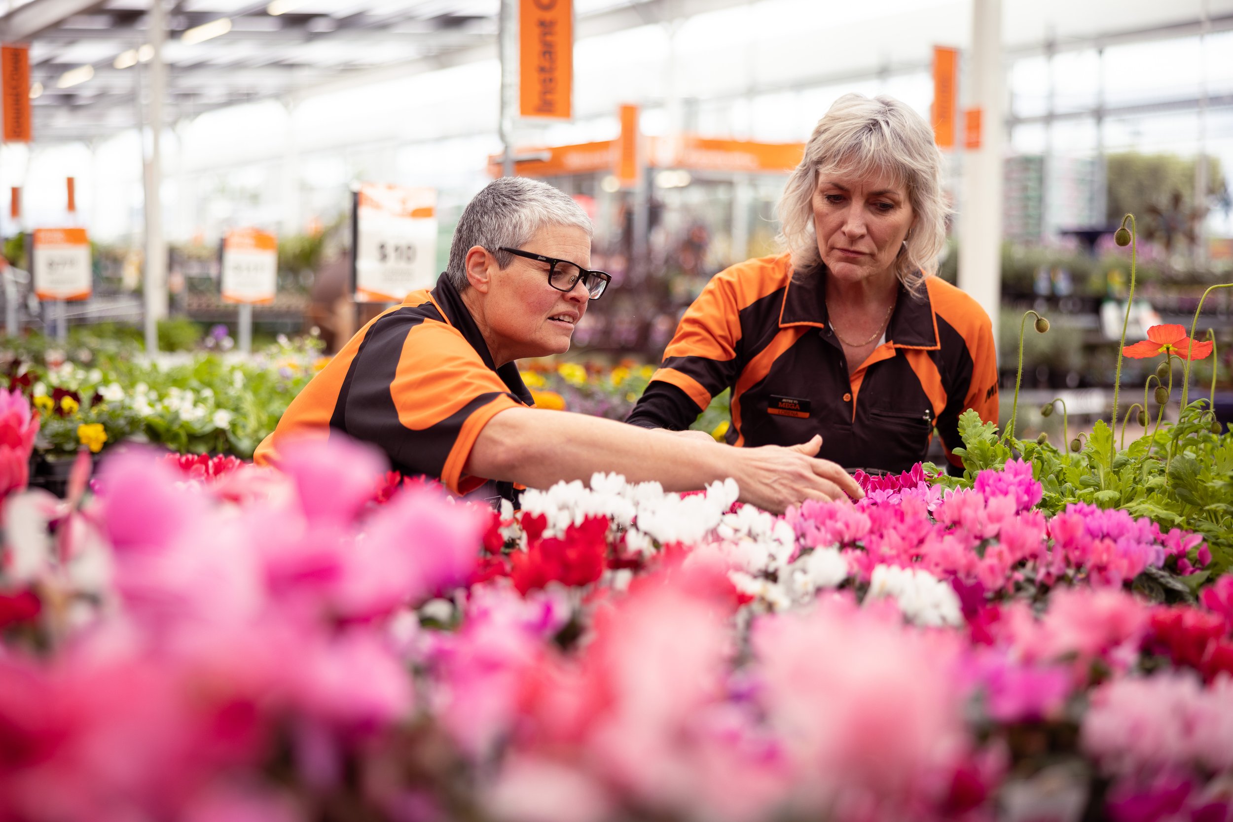
With fresh ideas, new technology and their ‘arms-wide-open’ approach, nothing rains on this team’s parade. Now fully roofed, the only place rain falls inside is in two 30,000L tanks.
Feeding a sophisticated irrigation system, it not only eliminates using town supply, plants are flourishing – noticeably so. Staff efficiency has also gained. Despite the new technology – rather than downsizing the garden centre’s team – it has increased from 14 to 25, as supervisor Lorena Stead and 2 IC Marisa Pirina shift up another gear.
“Spring is our busiest time of the year. It’s like turning the lights on,” says Lorena.
Customer focus underpins this store’s entire purpose. That means people on the floor and more time to greet and help customers. The café moved instore, but still overlooks all the activity. Opening up the garden centre not only created additional space for more stock, visibility increased thanks to new, lower plant bays. The Garden Hub is also a novel drawcard – a central station which enhances staff’s ability to handle customer queries. Just outside is the plastic pot recycling bin – another sustainability initiative, which has seen 900kgs recycled in the past 10 months. And that’s not counting any containers foraged by customers. Mitre 10 even takes polystyrene – number one in New Zealand to do so.
Changes also flowed instore. By definition, ‘garden’ has assumed an entirely new meaning.
More than a green space for trees, flowers and veges; outdoor zones are another room – an extension of how we live, play, entertain – even work. Anything from a simple patio now extends to sophisticated retreats – fully sheltered or open-air; lit and heated. As much as gardens grow, so has this store’s vision, according to Lorena.
“Gardens are another room in the home. But there’s also the internal garden – indoor plants – not only but also.”
Specialty zones cover the full gamut – from indoor plants, tools, plant care, ornaments and rainwater storage systems to probably the Bay’s largest selection of outdoor furniture, BBQs and every accessory to match. If you can’t find it, this store will seek it. Being owner- operated and part of a solely New Zealand co-operative, buying power and access to a wide range of products strengthens this hugely successful business.
Innovation and a "people first" mantra feed this store’s belief in mutually beneficial relationships – from everyone who walks in the door to everyone on the shop floor.
Newbies to long-timers, staff know their stuff; and they know people. Customers come from far and wide, such is the store’s reputation for familiarity. It’s an attitude Mitre 10 MEGA Tauranga continually works on. And customers feel it. Regulars watched closely as the garden centre remained open throughout the renovation. Written feedback was overwhelming and staff are grateful.
Inspired by the new look, Lorena and Marisa say customers love all the initiatives as well – especially how
plants respond to the new irrigation. Both agree the garden centre looks and feels brighter. True to the "spring has sprung" philosophy, team members are also thriving – watching their garden grow as natural rain waters it from above.
A fine balance
Lisa Perko from Wantem Design reveals why texture and layering are crucial for any lived-in space.
Lisa Perko from Wantem Design reveals why texture and layering are crucial for any lived-in space.
Photos Jahl Marshall
Texture is one of the most important elements in interior design as it helps to keep a space from feeling flat and one dimensional. Adding texture allows a space to come alive and provides a tactile experience with many points of interest.
Texture refers to the different surface qualities of floors, walls, rugs, furniture and soft furnishings, and texture can be either visual or tactile.
For instance, walls can have a variety of tactile textures, from seagrass wallpaper to exposed brick. In the photos I’ve used a specialty paint finish called limewashing. Limewash creates surfaces that are mottled and matt with a chalky texture - something like suede. It lends a depth and luminosity to flat walls.
I have introduced different textures and layering by grouping contrasting textures together - smooth polished décor items with matt textured ceramics or patterned objects. Plants are also an easy way to introduce texture into a room. Mixing materials and layering is the key to making textural elements work.
To get this right, don’t overdo it as introducing too much texture will result in a cluttered look, feel overwhelming and compete for your attention. The key is to balance it with neutrals and smooth clean lines to allow your eyes to rest.
To achieve a cohesive and welcoming textural experience, decide on your design style first and then work through the different elements of the room to explore where you can introduce texture. Start with the floor, then walls, furniture, lighting and ceiling, then soft furnishings and décor items.
A well-thought-through textured interior should create tactile moments that invite touch and delight the senses. Whether you choose a patterned rug to warm up your bedroom floor or a wooden coffee table to bring life to your living space, the importance of texture is clear. It completes the room.
So don’t be scared to try different combinations and layers. Step back and assess the results. Do they add appeal to the overall design or just clutter? Keep experimenting until you feel you have achieved the right balance. Enjoy!
Breaking new ground
At the flooring industry’s coal face, men dominate the hands-and-knees’ work, but this mother and daughter duo are bucking the trend.
At the flooring industry’s coal face, men dominate the hands-and-knees’ work, but this mother and daughter duo are bucking the trend.
Words Jo Ferris / Photos Alan Gibson
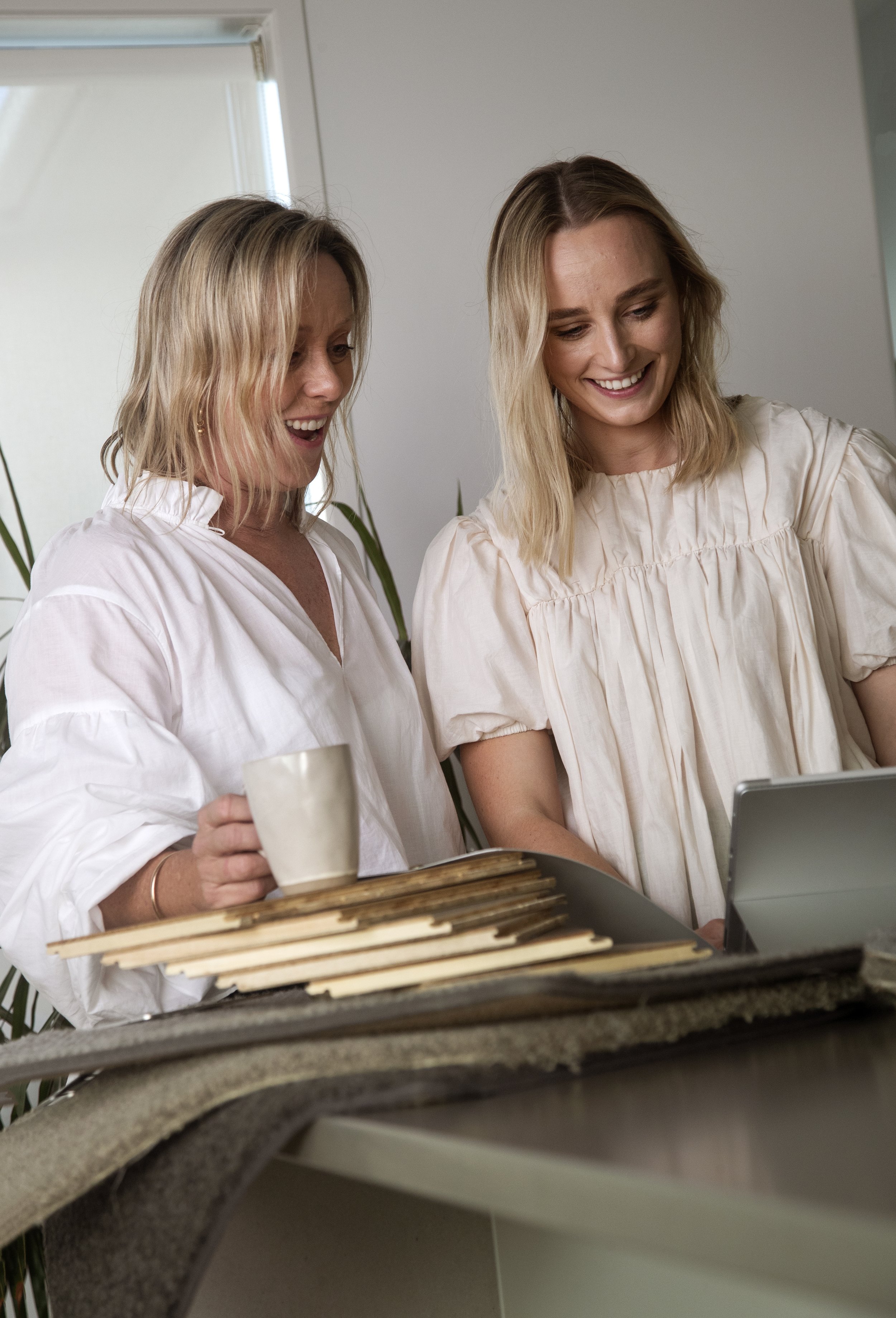
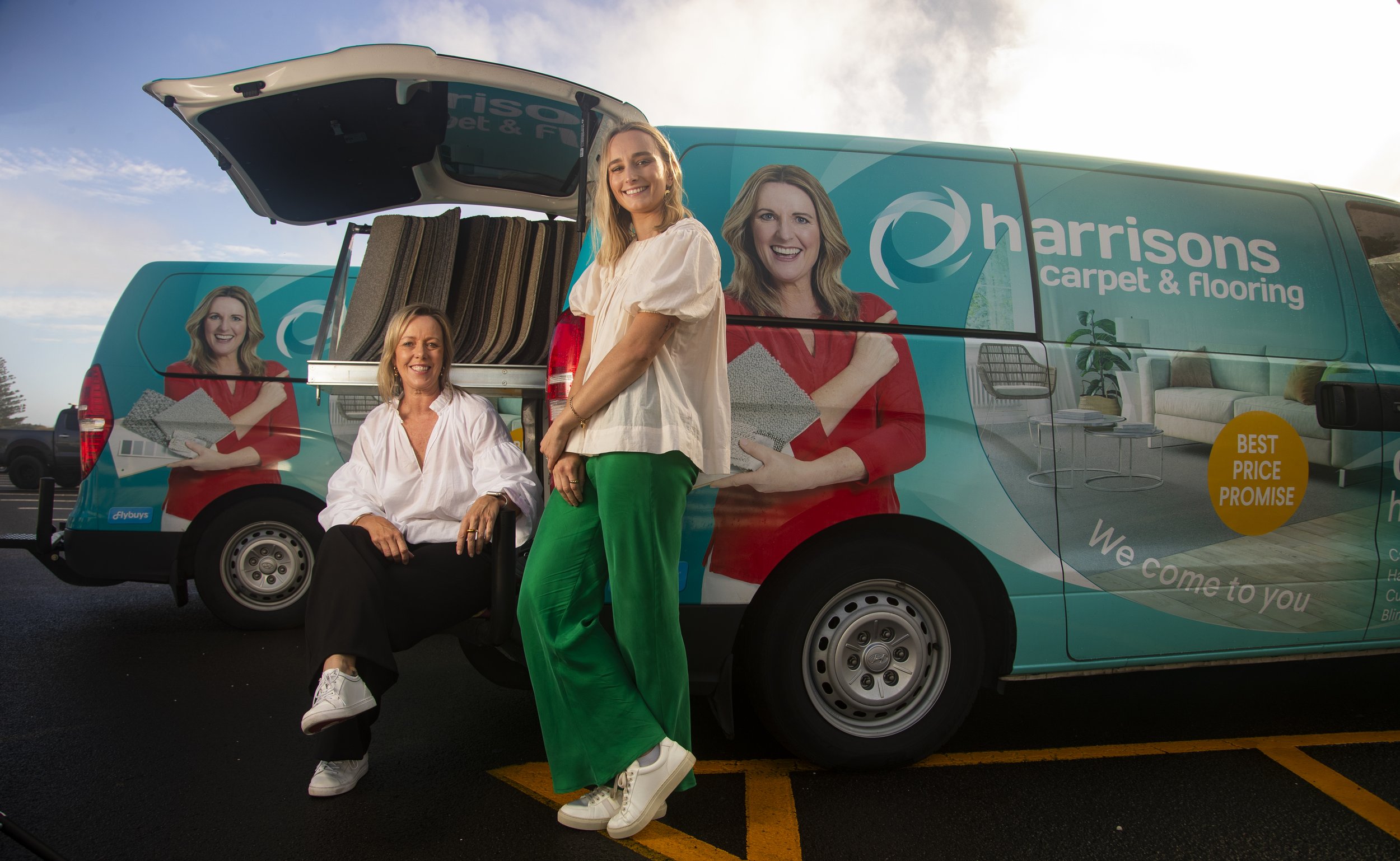
Sarah and Caitlin Tavendale might not install flooring; but from go to whoa, theirs are the faces customers see most. It’s a unique situation – and relationship. Not only do they own and operate a Harrisons Carpets and Flooring franchise each, they are the only mother and daughter in New Zealand to do so. Furthermore, Caitlin – at 24 – is the youngest owner in the country. She was just 22 when offered a franchise, fresh out of university. With a drive to succeed and a passion for interior design, there was no stopping her.
Sarah had already been in the Harrisons family for more than two years - a big step, but not as daunting. Seventeen years as a legal executive and several years as a co-owner in a recruitment company, was followed by an intensive nine years as operations manager for a family fishing business.
“It was time to do something for myself, something I was passionate about and had more control.”
That opportunity arose when Harrisons’ previous owner in Tauranga wanted to retire. Meeting Harrisons’ criteria, Sarah threw herself into invigorating a business she knew was ready for some fresh ideas.
“It was either sink or swim – so I jumped right in.”
Utilising Harrisons’ systems and flying solo, Sarah increased business within 12 months, expanded her installation teams and moved premises. By definition, that doesn’t mean a public showroom, but having a well-equipped warehouse to run a better operation.
The Harrisons’ model is mobile. Hands on. Same branding, systems and products. Otherwise, it’s all about the franchisees. In Sarah and Caitlin’s case – they are the only people customers see, until contractors move in. Even then, these women remain hands on until the end.
It’s pivotal to this duo’s success – that, and an exceptionally close relationship. Not all mothers and daughters can work together; even get on, at times. These women are not only great friends, but share ideas and visions for both businesses – usually over a glass of wine.
Gaining a degree in HR and commercial law, Caitlin admits she didn’t know what she wanted to do, initially. Helping Sarah with office administration, her plan was to head to Australia. Then Covid hit. Followed by something else that changed their lives.
With Tauranga’s exploding growth, the opportunity arose to buy a new area. Caitlin wasn’t sure – until interviews and initial concerns by head office cemented a stronger desire to succeed. Even Sarah had initial hesitations, not on Caitlin’s ability, but more about her own reservations. Between them now, they cover Tauranga North and Tauranga Central – early Papamoa down the Mount coastline and from Greerton to Waihi Beach.
Eighteen months on, Caitlin is as passionate as her mother. Sharing premises, they now employ permanent office staff and have several contractor teams.
Life is full on. Working out of the familiar Harrisons’ branded vans – both women believe the mobile model is key. However, it’s their one-on-one approach, often working together in their desire to help people choose the right products, textures and colours for their homes. Taking samples to the home eliminates homeowners running back and forth – as consultations are all handled within their own space.
For these women, people don’t just buy a product, it’s about the service.
As a brand, Harrisons was highly recommended by Readers Digest in its 2022 most trusted list. Sarah and Caitlin are proud to belong to that wider acclaim.
“We’re proud of what we have achieved so far, and look forward to the future.”
Dynamic women – obviously with much more up their sleeves.
To the lake house
To the lake house
Papamoa’s Pacific Lakes Village opens its celebrated Lake House
Papamoa’s Pacific Lakes Village opens its celebrated Lake House
Words Monique Balvert-O’Connor / Photos Jahl Marshall
Some may ponder whether it’s possible, but life has just got even better at Pacific Lakes Village.
The already widely admired lifestyle village, located on the coastal stretch between Mt Maunganui and Papamoa, has recently celebrated the opening of its Lake House.
Pacific Lakes Village Manager Mark Vincent says the Lake House – so named as it is beautifully positioned over one of the village lakes – will cater for a wide range of resident activities.
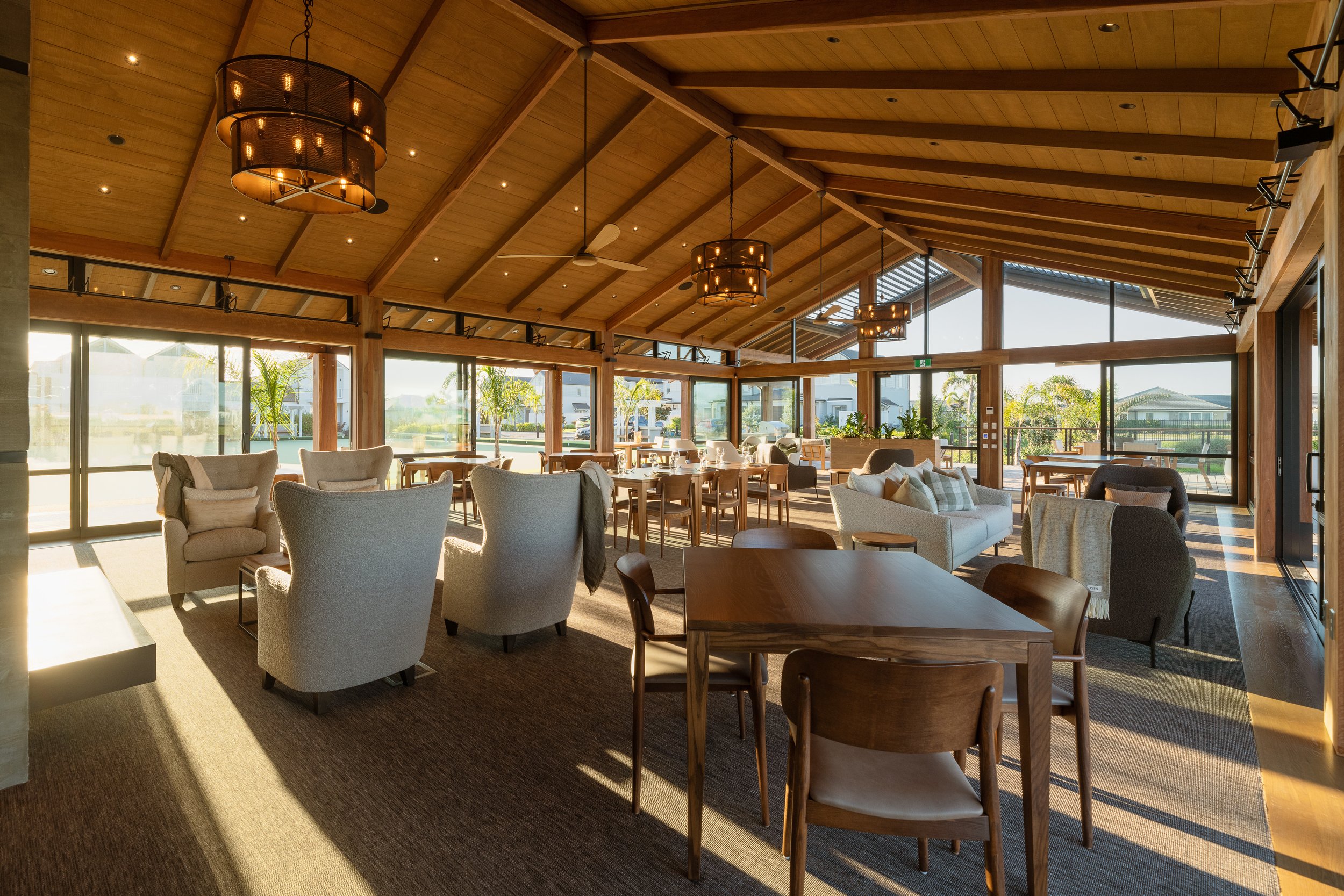
Architecturally designed, the Lake House offers a fabulous community hub for events, activities and socialising and incorporates sweeping decks and a barbecue area over the lake. It is home to the Little Green café, which has been welcomed with great excitement by residents, Mark says. Adding to the socialisation options, and positioned alongside, is a full-size, green-weave bowling green.
“Our intention has always been to offer our residents a unique, modern, and engaging community with resort-styled living in a place that is both tranquil and energising. The Lake House is a big part of that picture. We’re delighted and encouraged by the positive feedback we are receiving from everyone who is so proud to call this village home, and from those hoping to make it home,” Mark says.
Also impressing people is the fact the Lake House is totally in-line with the village’s overall sustainability ethos – it operates off-the-grid, with solar power and a rainwater recycling system. The Green café alone can boast many sustainable aspects too.
Mark says the completion of the Lake House demonstrates the direction and quality of Pacific Lakes Village and has been a big milestone for the village.
“We have more than 180 residents and with the Lake House comes a gathering point and the opportunity to establish a real sense of community. That’s extra important to us as our model is firmly rooted in hospitality – somewhere you’d be happy to visit and invite friends to visit.”
The need for such a gathering place will only increase as the village grows. By the end of the year, 160 homes will be constructed. When completed, the village will comprise 250 homes set amongst tranquil park-like grounds and private lakes. The next stage of villas and terrace houses are selling now.
While the Lake House (which opened in mid-May) is already garnering many ticks of approval, it is actually a precursor to a planned, larger pavilion. With an estimated cost of more than $30 million, it will be one of the largest and most comprehensive community facilities in any NZ lifestyle village.
Pacific Lakes Village Director Graham Wilkinson says the rapidly burgeoning Bay of Plenty population will be watching this village with interest, especially those seeking a more upscale living and caring environment than previously offered in the area.
The village is part of the Generus Living Group, which has an unrivaled reputation for creating some of New Zealand’s most respected lifestyle villages. That respect includes an appreciation that Generus Living strives to make a difference in providing upscale sustainable living environments.
Sustainability abounds
Pacific Lakes Village is steeped in sustainable and eco-friendly ways of living, and its residents are loving this.
A recent resident survey illustrated that a sustainable lifestyle is either important or very important to 94.43 percent of village residents and more than half of the respondents said the approach to sustainability contributed to their decision to purchase at the village.
Examples of this sustainable approach are many and include:
Plans for Pacific Lakes Village with a glasshouse, a climate-controlled growing house, and a variety of fruit trees
Each residence has its own raised garden beds for vegetable growth
The village is creating its own ecosystem via a series of waterways, fed from rainwater and natural aquifers that will support the regeneration of plant and birdlife
The Lake House is first of its kind - almost everything about the building celebrates sustainability. Aligned with sustainable building design, it is off the grid with solar power and a rainwater recycling system. Building materials have been carefully considered and, whenever possible, environmentally preferable solutions have been selected
The Little Green Café products have been mindfully selected. For example, the menu features coffee sourced from ethical, sustainable and socially responsible traders; and an organic soda range from a NZ company on a mission to find ingredients good for the land, and good for the people who grow and consume them
The Little Green Café also minimises its waste, which is destined for the village’s worm farms or green waste composting facilities. Ecoware take-away cups are made from plants, although residents are encouraged to bring their own Keep Cups
Pacific Lakes Village has received a remarkable gold status on Tauranga City Council’s Resource Wise Business Programme, thanks to diverting more than 98 percent of operational waste from landfill
Chemical use is minimised in landscaping, solar energy is utilised, LED lighting is favoured, there are EV charging stations, and water is conserved through the utilisation of smart technology.
In short – a sustainable lens is adopted to all aspects of the business.
Benefiting the community
When completed, Pacific Lakes Village will have involved an investment of almost $300 million, says Director Graham Wilkinson. The bulk of that has gone to local suppliers and contractors – plus, the village provides employment on an ongoing basis.
“Generus Living’s business model has always been to work with the community and part of that involves supporting local and incorporates our sustainability programme. We’re also proud to announce the recent introduction of an Ebba Te Tua scholarship with a focus on furthering Māori education.”
The scholarship has been introduced in association with Mangatawa Papamoa Blocks Incorporated (MPBI) – Generus Living’s development partner. Generus Living and MPBI have worked together as joint venture partners for almost a decade in developing first Pacific Coast Village and now Pacific Lakes Village. This unique partnership is a marriage of experience and capital with land and tradition and is committed to continuing to collaborate and create value with and for the community it serves.
Secret garden
Pulling from Hawke’s Bay’s Black Barn, Glenorchy’s Blanket Bay, and Huka Lodge in Taupō; Te Māra commands equal status as one of Bay of Plenty’s finest country homes
Pulling from Hawke’s Bay’s Black Barn, Glenorchy’s Blanket Bay, and Huka Lodge in Taupō; Te Māra commands equal status as one of Bay of Plenty’s finest country homes.
Words Jo Ferris / Photos supplied
From its secluded plateau in Whakamārama hills, the timeless design and nuance of this property applauds the collaborative approach of architectural and interior designers. But it’s mostly down to the lady of the house, whose vision entailed matching her dream home with a garden that would eventually embrace it.
Bare land five years ago, the home now melts into a garden, blending symmetry and corridors to frame the outstanding coastal views, an orchard and home for chickens, as well as a poolside haven and meandering pockets where potager gardens and herbs interweave seasons, colour, and inspiration.
Two te māra, Yoshino cherry trees, grace the entrance and give the property its name. That it took just five years to cultivate the depth and scale of this garden heaps further praise on the owners. Both the garden and home look and feel like they have been entrenched in seclusion far longer. Which was the plan from the outset, of course.
For the home, the brief was small but detailed – emphasis on “home”. Its intimate embrace graces every corner. It is somehow familiar, yet utterly unique. The tone and texture rest on the seemingly complicated, yet incredibly simple way each element fits like Lego. In fact, the owner utilised her son’s Lego bricks to construct her vision.
Architectural designer John Little was delighted by this novel approach.
“I style my designs on the enduring principles of good scale and proportions – and simple form.”
Based on that, and nodding to good New Zealand vernacular, the result is a three-bedroom ranch-style dwelling with verandah corners and garden pathway to the separate garage and studio accommodation. This intimate unit also bears Te Māra’s name in booking circles, and is deservedly ranked with A-reserve popularity. Black dominates the exterior board and batten and corrugated roofing to show how a simple building form and modest materials can successfully execute unpretentious expense.
Built by Mark Leppard with refined detail, the home’s north orientation follows the sun. Colonial timber joinery matches the underlying approach of a simple country cottage. In truth, there’s nothing simple in the way every detail is meticulously crafted. The house simply belies its age, thanks to its timeless affinity and connection with the scenery and outdoor flow.
The family relationship focuses on a farmhouse kitchen that celebrates infinite craftsmanship and French influences. High studs throughout enhance space. Dining and fireside gathering all revolves around togetherness and that familiar sense of home – one that invites entertaining for large occasions. As living slips into the cosier intimacy of the library snug, this home embodies its appreciation for privacy, while remaining connected and true.
Interior designer Terry Walsh says what separates this home is its use of materials.
“The painted timber joinery visually illustrates what an investment into signature elements can achieve. Other materials have been kept honest with their simplicity. The client and I always knew what we aspired to. It’s a no fuss look, while capturing a luxurious feel, combined with ‘less-than-perfect’ aspects.”
Wire-brushed herringbone flooring runs the length of the passage and living areas to instil that initial sense of age. European tiling in bathrooms and laundry feature patterned styling that also flatters the appeal of legacy, while heritage hardware throughout accentuates the significance of detail.
Beamed ceilings and battened walls unite the symmetry, while various angles and stud heights accentuate each room’s mood. But the gabled height of the lounge, with its concrete fireplace and antler chandelier, draws immediate attention.
Bespoke finish is epitomised by the owners’ ability to source individual pieces – for the home itself and personal collectables gathered over the years. Built-in units have no place in the likes of the bathrooms or laundry. Stand-alone pieces instil the intrigue of antique heritage with the knowledge that nothing else exists in the delivery of these rooms.
It was important to set the foundation for the furnishings that were to come. Whether it’s the flooring from Auckland’s Artedomus, delicious hues of Porter’s Paints personalising each room, or the final dressings with lighting, drapes and imported antique items from Auckland’s Vitrine store; the extent of detail and placement of beloved items honour every layer of design expertise.
In his first visit, Cam Winter from Oliver Road Luxury Real Estate says Te Māra is one of the finest country homes in the Bay of Plenty.
“This truly world-class, seemingly-effortless execution of magazine-worthy interior and timeless architectural design is a pleasure within which to spend a single moment, let alone a lifetime. It’s also available for inspection by qualified buyers and those interested should visit our website for more information. “
A touch of glass
Palm Springs meets mid-century modern in this Thorne Group show home.
Palm Springs meets mid-century modern in this Thorne Group show home.
Words Monique Balvert-O’Connor / Photos supplied
There’s much that shines at the latest Thorne Group show home in Papamoa, but there’s one feature that’s an indisputable standout.
Clever design showcases just how the outdoors can be celebrated within the framework of a house. Take a bow, Thorne Group architectural designer Jon McAlpine.
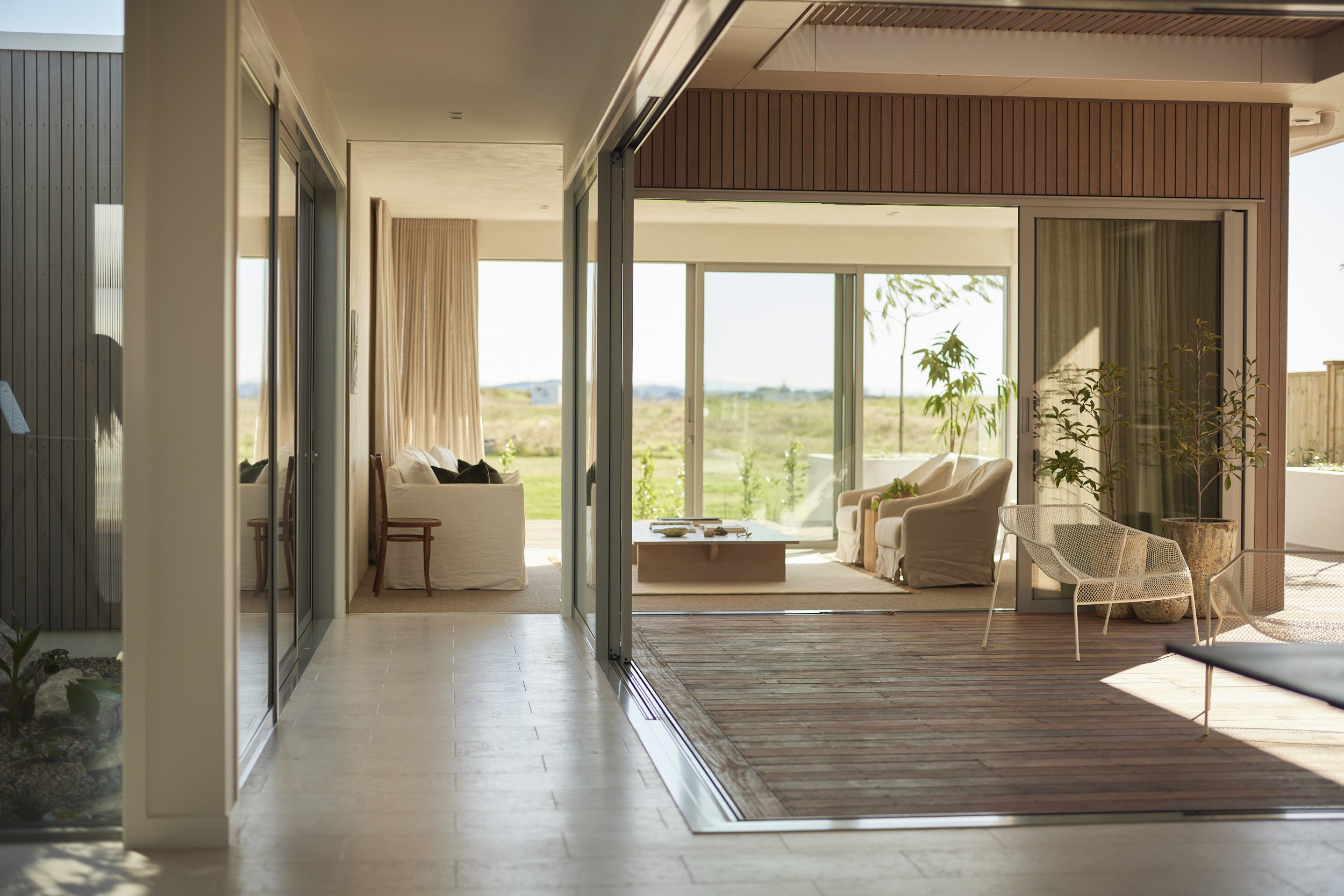
While “indoor-outdoor flow” has become a cliched description, this Palm Springs house is next level in this regard, with an internal garden and many walls of movable glass. There are a total of seven stacker doors, plus a few sliders, that open the house up to its architecturally landscaped gardens. The solar-powered home is a lesson in how it’s possible to both inhabit a building yet reside with nature.
This is evident from the get-go. Of immediate impact upon entering the home is its central atrium garden with a maple tree adding to the Japanese garden ambience. Glass walls surround this garden that’s open to the sky, with the two long walls featuring stacker doors, enabling the house to welcome the outdoors – both the garden and the sky – in.
That’s but the start. The home’s main living area wraps around an outdoor deck (topped by a slatted roof allowing for beautiful, filtered light and airflow.) Thanks to walls of glass, the view from the kitchen island travels over the dining room table to this deck, then through to the lounge and beyond to the expansive kwila deck out back that overlooks a man-made waterway. All these walls of glass are stacker doors, so the house can be opened from the kitchen right through to the deck at the back of the property. The hallway linking the kitchen to the lounge also features stacker doors opening to the covered outside area. There are, in fact, a total of six stacker doors in this main living hub, including one off to the side of the kitchen island where the side garden can be accessed. Along this same wall, the dining room’s built-in window seat languishes below a deep window with panes that also slide right back.
Then there’s the freestanding bath in the en suite, positioned behind, yes – moveable glass – so there’s a sense of bathing outdoors. Raised planter boxes provide privacy in this area facing the man-made waterway.
Given the home’s interconnectivity with nature, it’s little surprise that timber is beautifully showcased, and that Annique Heesen from Gezellig Interiors has ensured natural hues abound in the interior design choices.
Attention-grabbers on the exterior of this single-level home are its curved vertical shiplapped cedar walls, and a boardwalk of timber leading to the front door. The cedar is repeated in various key places indoors. The foyer is an immediate example, with its cedar wall and ceiling creating a seamless connection from exterior to interior spaces. Cedar also features in the main bathroom, on the wall dividing the master bedroom from its en suite, and is the cladding of choice for the outdoor fire surround – the view of which can be enjoyed from all the main living areas.
The cedar happily cohabitates with the home’s eco-friendly cork flooring and wool carpet, and with the many attractive displays of American oak; this timber is used for the kitchen cabinetry, for example, and to frame cavity slider doors featuring beautiful reeded glass.
There’s much to delight throughout this house. The kitchen skylights with automatic rain sensors, for example, or the solar generation with battery storage, or the limestone kitchen island bench, the traditional plaster render in the lounge and on the kitchen splashback and overhead cupboards, and the carport (with great road-side appeal) in lieu of a garage.
The multi-functionality of one of the three double bedrooms also hold appeal. This bedroom features a double bed that folds down from the wall, has its own entry via an external sliding door, and incorporates a dual-access bathroom. It can easily be shut off from the house to form a private visitors’ pad or a workspace. The home does, however, already feature an office. Both the office and a super-sized scullery are sited behind the kitchen’s back wall.
Adding to the overall appeal is the fact the home has been designed to gain 6 Star Homestar accreditation. “Eco-friendly materials and finishes” and “sustainability” have been guiding words in this showhome project. Along with the design itself, all the fixtures, fittings, and materials have been meticulously thought out and calculated to ensure they comply within Homestar guidelines. As expected -- given the many glass walls -- the design optimises passive solar energy, too.
The design brief for this house was Palm Springs with a mid-century modern approach. That box, and so many others, have been ticked. It’s little wonder that word on the street, surrounding this Montiicola Drive address, is that this house will be one to watch out for at architectural awards time.
Warm welcome
UNO’s new interiors expert, Lisa Perko from Wantem Design, offers tips and tricks to make your home more inviting, comfortable and a joy to live in.
UNO’s new interiors expert, Lisa Perko from Wantem Design, offers tips and tricks to make your home more inviting, comfortable and a joy to live in.
photos Jahl Marshall + supplied
Everyone’s path into the world of interiors is different. In my case, it was more of an evolution. I was in my 30s when I remodelled my first home. I still remember the feeling of excitement having this blank canvas to work with; reconfiguring floorplans, paint colour, furniture and the thrill of watching the transformation take place. Once it was finished, I sold it and did the same thing to my second home and then third.
Fast forward 10 years of buying-selling-moving in Vanuatu and then Auckland, I found myself relocating to Tauranga, looking forward to the next project. However, I upset the apple cart by falling in love with the property I was working on and wanted to stay. I decided this time to stay in the house, but, missing the rush of a new project, I knew I must be hooked.
So I went back to school and earned a Diploma in Interior Design, so I could continue transforming homes. And I could not be more grateful for where I ended up.
For my first entrance as UNO’s interior design columnist, I thought it befitting to talk about the place where you first enter a home: the entryway.
Entryways provide the first impression of your home. They also provide a functional purpose of taking off shoes, hanging bags and coats, depositing keys and letters. Typically, entryway furniture consists of a console table, decorative décor, mirror, artwork and seating.
Styling is all about putting together a combination of the above items to create a wow factor. No matter what the size of your entryway, follow my steps on where to start.
Step 1
Assess the size of your space. This dictates how the area can be decorated. The important factor here is not to block the natural walkway. If space allows, start with a console table. To personalise the look, add items like a bowl for keys, books, vase or plant. Fill the wall space above the console with artwork or a mirror. Leave as is or add seating and voila! For narrow spaces, focus on the wall space instead. Add items that take up little bulk. For instance, mirrors, artwork and decorative hooks for bags and coats.
Step 2
With your layout now configured, for continuity, make sure to choose furniture that complements the rest of your home.
Step 3
A show of romance
This Palm Springs-inspired show home may be brand new, but a nostalgic-yet-modern use of art deco sensibilities hark back to its exotic desert namesake.
This Palm Springs-inspired show home may be brand new, but a nostalgic-yet-modern use of art deco sensibilities hark back to its exotic desert namesake.
WORDS Monique Balvert-O’Connor / PHOTOS Jahl Marshall
They say home is where the heart is, and G.J. Gardner’s new Pāpāmoa show home may just set yours aflutter. Named Desert Romance, 9 Monticola Drive, Palm Springs really is a stunning marriage of form and function from the inside out.
G.J. Gardner Tauranga South franchise owner Kirsty McConnell enjoyed working on the architectural and interior features, with its light and airy ambience and “modern art deco twists”.
“We wanted to do our own spin on a Palm Springs theme. Art deco sensibilities are part of the Palm Springs aesthetic so we’ve referenced that in features throughout the home,” Kirsty says, adding that curved walls and cabinetry, detailed circular brass fittings, and generous tropical planting inside and out are obvious examples.
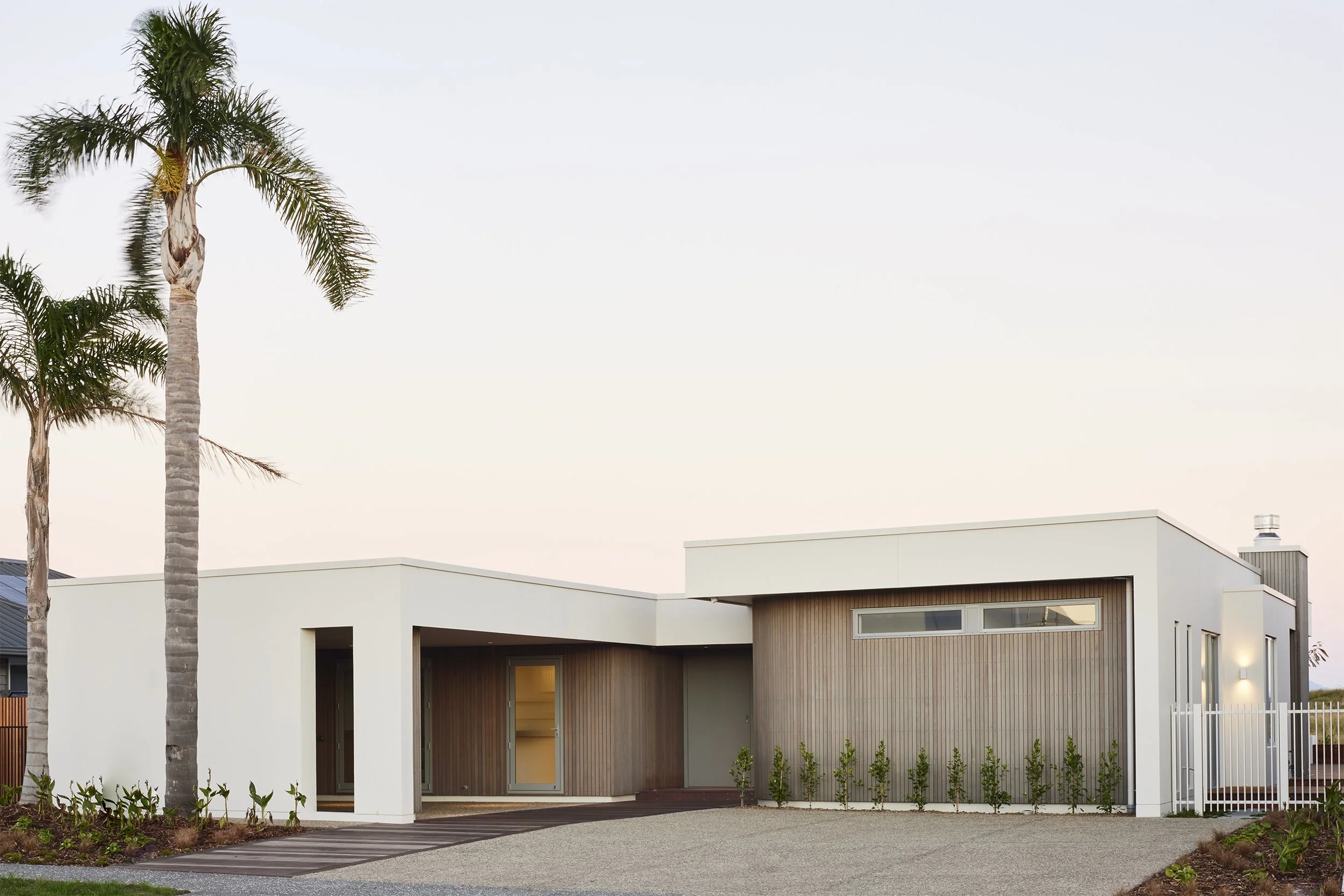
The single-story show home, spanning 321 square metres, including alfresco, is multi-gabled and clad primarily in San Selmo ‘Cashmere Grey’ brick. White-painted board and batten also features as a popular home owner choice, and adds to the exterior’s appeal. So too does the driveway, with white seashells embedded in its lightly hued ‘Horotiu’ concrete.
The show home may be recently completed, but care has been taken with the landscaping to ensure large tropical plantings give it immediate substance.
The home is positioned on the section to allow for a large family-sized swimming pool, something that would complete the Palm Springs look nicely.
Inside this four-bedroom home, there’s not far to travel for the first glimpse of Kirsty’s desired décor, featuring “art deco with a modern twist”. The entranceway includes DecoForme half-round oak detailing from floor to ceiling. Decoforme features in the kitchen Island cabinetry, master bedroom as a headboard, and also behind shelving in the transitional hallway between the main living area and master suite.
Another décor touch of significance is the use of brass throughout and in circular form where appropriate – for example the light fittings. Most obvious examples include the huge brass rings that interlink to form the media room’s dramatic light fitting. A singular brass ring was selected for above the dining table, while a round-edged hanging pendant over the kitchen island also draws the eye. Orbital lights, hanging in clusters of three encased in a brass fitting, are stunners in the white-tiled bathroom and en suite.
The brass theme also impacted on the show home’s coloursteel roof, Kirsty points out. The colour – which many people comment on – is Colorsteel Lichen, and presents as a brass hue. A visit to Dulux ensured a paint colour match, to grace the media room’s walls, albeit with verdigris pigment. The majority of the home’s other walls are white, to beautifully complement the honey-oak colour of the DecoForme timber.
G.J. Gardner Tauranga has three in-house interior designers. Kirsty encourages collaboration for the best result when making the show home’s many décor choices.
Also working with Kirsty on her vision for the show home architectural design was Renata Kelly from Cornerstone Design. Her plans include detailing such as the home’s high stud and big gable ends – perfect for enabling and emphasising the view of the Pāpāmoa sky. The house enjoys a 2.7m stud throughout, with vaulted ceilings in the Family and Media rooms which takes the height to a spacious 3.2m.
It’s a light-infused home, thanks in part to the gables (which by their very nature, feature a high pitch and hence allow plenty of light in) and to skylights.
“There are amazing skylights above the kitchen area and the skylight cavity is quite special – a lot of work has gone into that to make it a feature. You have to see it to appreciate it,” Kirsty enthuses. Skylights also feature in the gabled roof of the outside seating area. The outdoor gas fire ensures the appeal of this area remains high in winter.
Another pleasing aspect of the home’s layout is that the kitchen can be accessed from the main living area and the media room (although a cavity slider can close this room off if desired). This well-appointed kitchen has two working zones, and – in a break from the norm – features a sliding window where a splashback would traditionally be. It’s just perfect for feeding food out to the alfresco dining area.
A wander through captures other points of interest, such as the stand-alone bath in the main bathroom; a separate powder room; and oversized bedrooms with in-built cabinetry, cupboards and shelving.
That’s but a taste. There’s plenty to fall in love with in this romantic home affair.
Wisdom & wonder
She might be renowned in the Bay for her property prowess, but Bayleys agent Kay Ganley knows you’re only as good as your team.
She might be renowned in the Bay for her property prowess, but Bayleys agent
Kay Ganley knows you’re only as good as your team.
words Monique Balvert-O’Connor | photos Salina Galvan
Kay’s team clockwise from top left: Rebecca, Kimberly, Jenni, Conrad, Kay and Vanessa.
After 23 years in the real estate world, there’s not a lot that multiple award-winning salesperson Kay Ganley doesn’t know about her industry.
And one of those wisdoms, accrued over recent years, is the value of having a team to help her continue to impeccably serve the Mount Maunganui and Papamoa residential property market.
It’s four years now since Kay – who works under the Bayleys Mount Maunganui umbrella – created her own team. That team comprises Kay, three other salespeople, and two personal assistants.
A huge number of listings provided Kay with the incentive to form her own team and she’s never looked back.
“If I am going to stay at the top of my game and not burn out, then I need other good people at my side so we can collectively provide the best possible service. We have each other’s back and provide back-up for each other.
“I can’t imagine not having a team now. Not only does it create a supportive working network, but I like being surrounded by people and sharing my knowledge, and helping them get established too. It has been great to see them flourish. Our team does very well,” Kay says.
Indeed, this people-and-service-focused team does do well, as the plaudits show.
Last year Kay took out top prize for Success Realty Ltd (covering the Waikato, Taranaki, and Bay of Plenty) in the residential category and over all offices (residential, country and commercial) in the same geographic area. The latter is the top prize, and Kay has achieved this over the last two consecutive years. The Kay Ganley brand also scored the top salesperson accolade in the Bayleys Mount Maunganui office for the last eight years; and has sat in the top three nationwide for residential sales.
Kay’s handpicked hard-working and fun-loving team members are Conrad Doyle, Vanessa Wansbrough and Kimberly Bain. Rebecca Yeaxlee and Jenni Stevens fill the personal assistant roles.
Conrad Doyle
Kay saw plenty of promise in Conrad, and her daughter, Chloe Ganley, concurred. Conrad is Kay’s son-in-law – she suggested he make the break from his previous job and move into real estate. His sales background has stood him in good stead, she says. Conrad, who has been part of Kay’s team since day one, has a reputation for being great with people and is regularly on the receiving end of fabulous feedback.
When not working, family pursuits keep him busy (he and Chloe have two young children) and surfing is a passion.
Vanessa Wansbrough
Vanessa has enjoyed a recent, personal real estate thrill – buying her own home in Mount Maunganui. She joined Kay’s team after moving over from Hamilton, armed with seven years’ experience in real estate.
Canadian-born, Vanessa can often be found scaling Mauao, or pursuing other health, fitness and mindfulness activities. Learning to surf is a summer goal, and there’s talk about joining Toastmasters too.
Kimberly Bain
Kimberly is a tried-and-true inclusion to the team. She was Kay’s personal assistant for a year and enjoyed real estate so much that she decided to get her license. She’s now joined the team as a salesperson, armed with a great handle on the nuts and bolts of the business. She’s gaining great traction as a salesperson, Kay says.
Her colleagues love her caring personality – she’s the office gift buyer! Outside of work, she enjoys fishing and is a keen foodie.
Jenni Stevens (PA)
Kay couldn’t believe her luck when former real estate agent, Jenni, opted out of selling and thought a personal assistant role would suit her just fine. Armed with all that relevant experience, it’s little wonder she’s considered a real asset to the team. This part-time role leaves Jenni with plenty of time to head away with her husband on caravan adventures.
Rebecca Yeaxlee (PA)
The newest member of Kay’s team, Rebecca had a fair idea of what she was getting into when she took on the personal assistant job – she’d been the part-time front desk administrator for the whole of the Bayleys Mount Maunganui office. Rebecca was keen to move into a bigger role and a full-time one. The opportunity to be on Kay’s team held plenty of appeal. Swimming and running keep Rebecca fit.
Kay’s property purchase
Earlier this year, Kay and her husband Mike Gallagher did some property buying of their own. They shifted from their Mount Maunganui apartment (now run as their Airbnb) to a 2,800m2 site, tucked down a long driveway in a quiet Papamoa cul de sac. There they have renovated and planted to create a tropical oasis.
Live Coveted: Simple but special additions that’ll turn your bathroom into a beauty
You can’t lose with these simple but special additions that’ll instantly turn your bathroom into a beauty.
THE EXPERT Nicola Travis
Bathrooms are usually small spaces, so keeping the styling simple is key. Use accessories like beautiful towels and fun bath mats to elevate the space and reveal your personality, adding luxurious soaps and candles that will both look and smell good. To bring warmth into the room, incorporate natural materials such as timber and rattan in the form of a basket or stool. Many plants thrive in steamy bathrooms, so finish the look with some lush potted greenery.
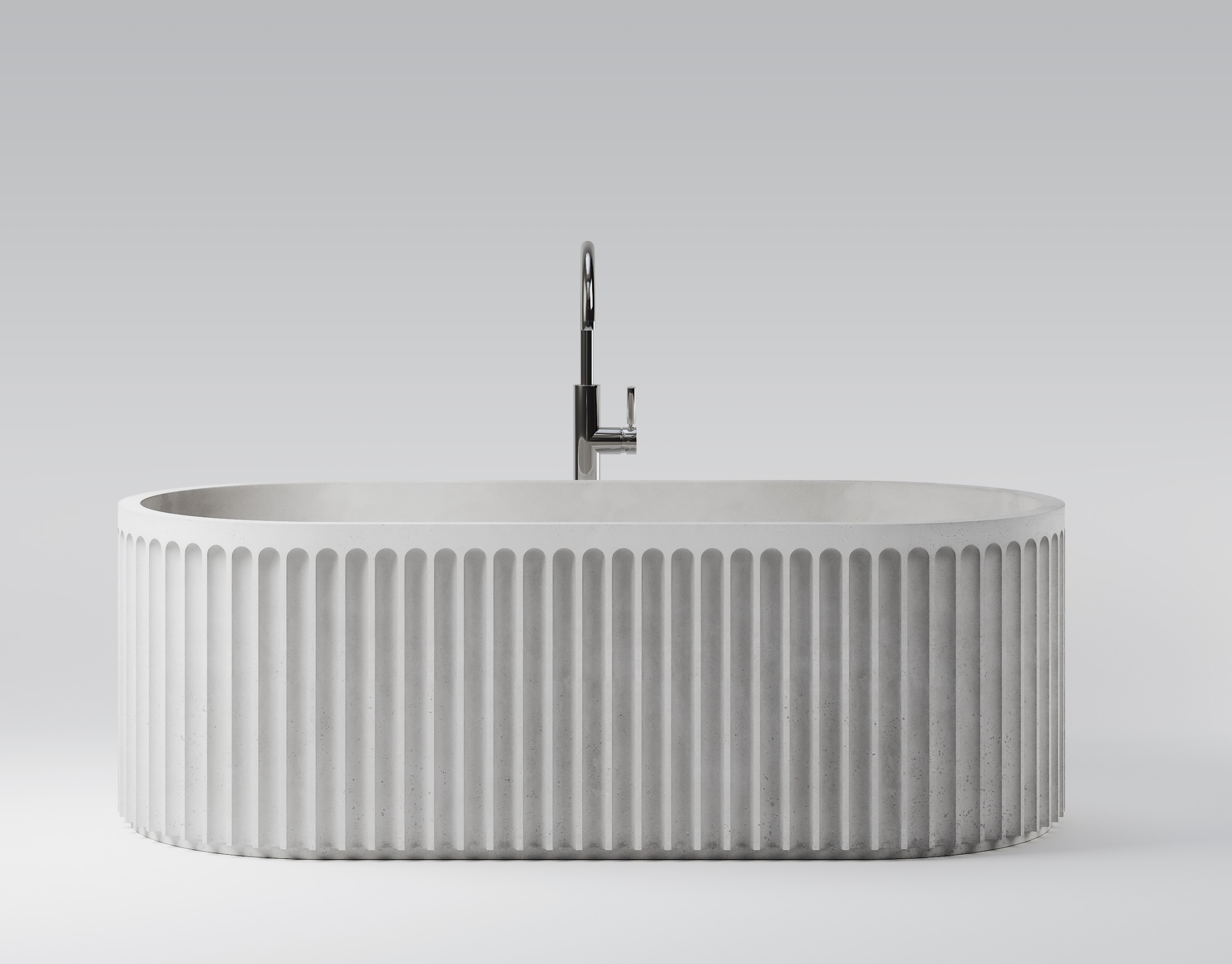
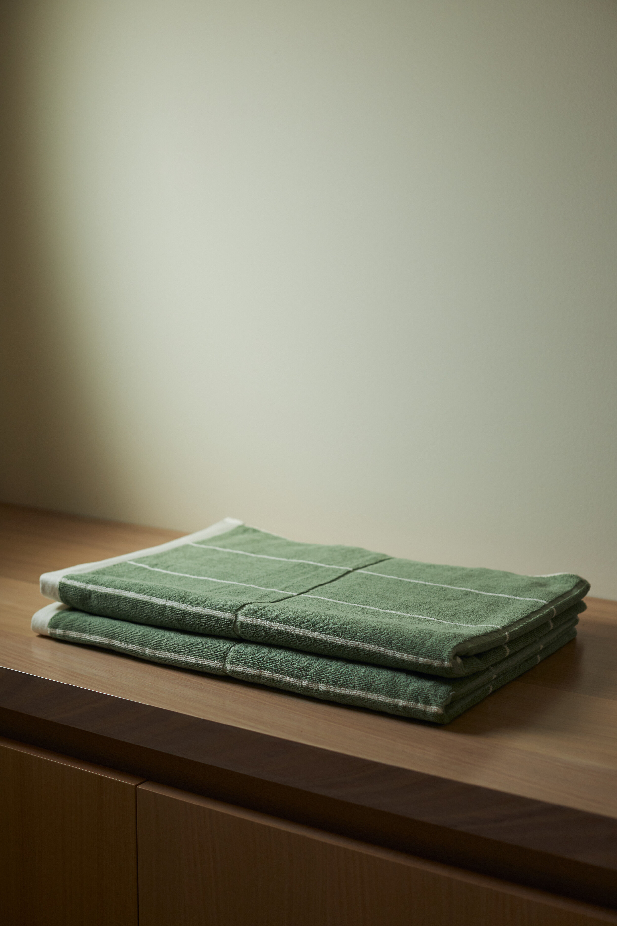
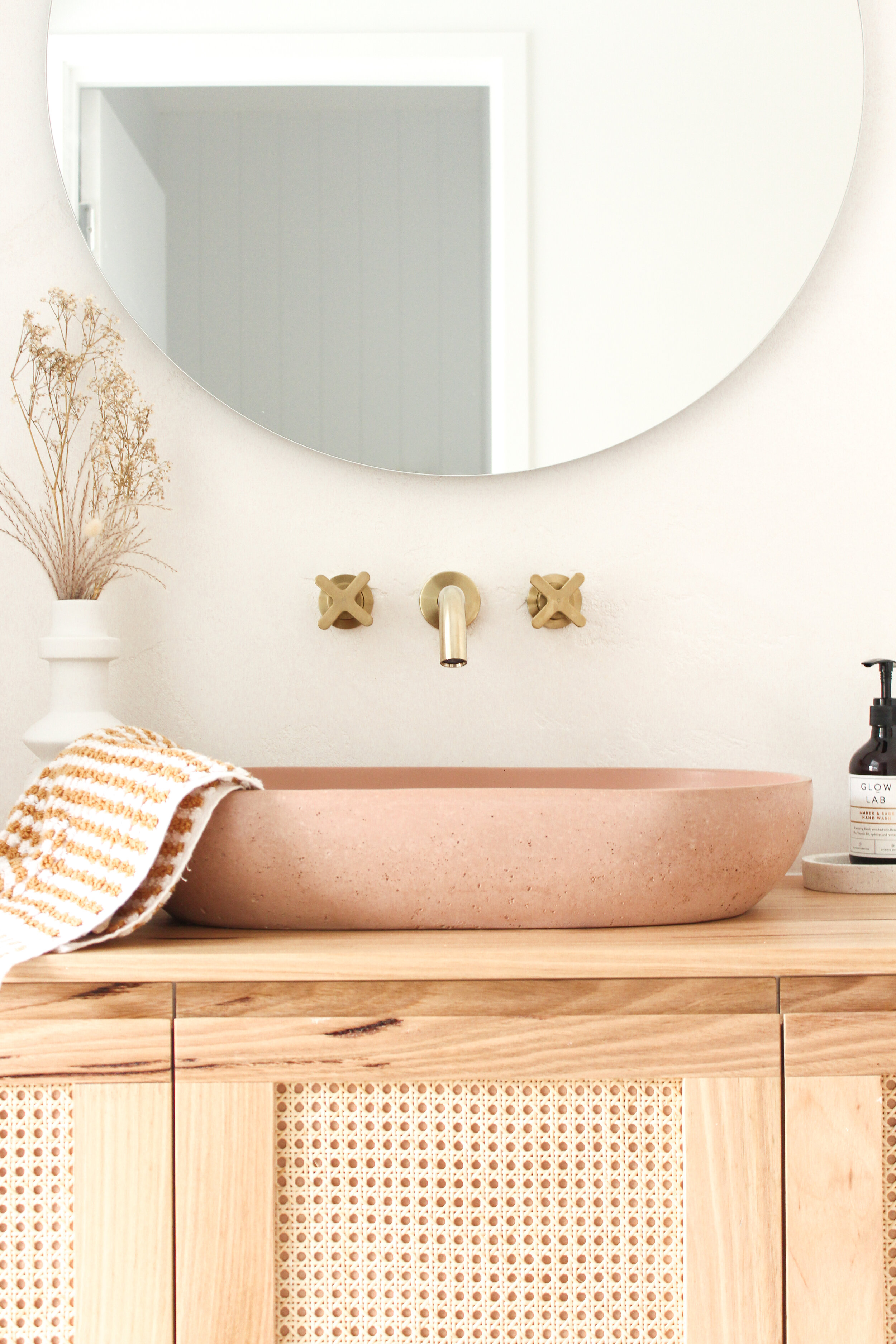
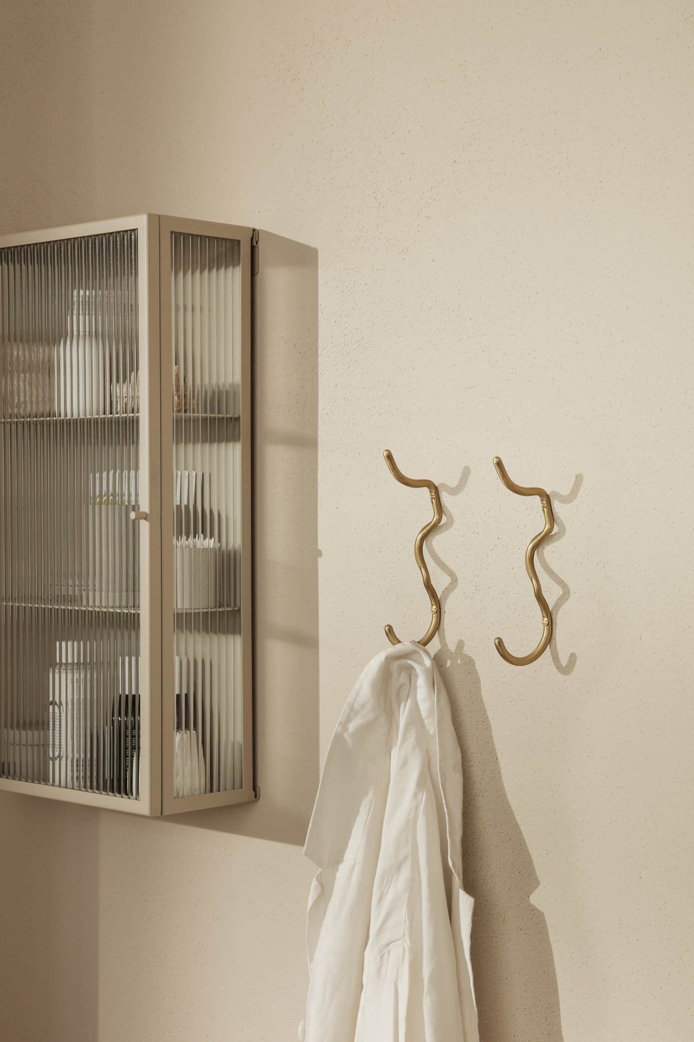
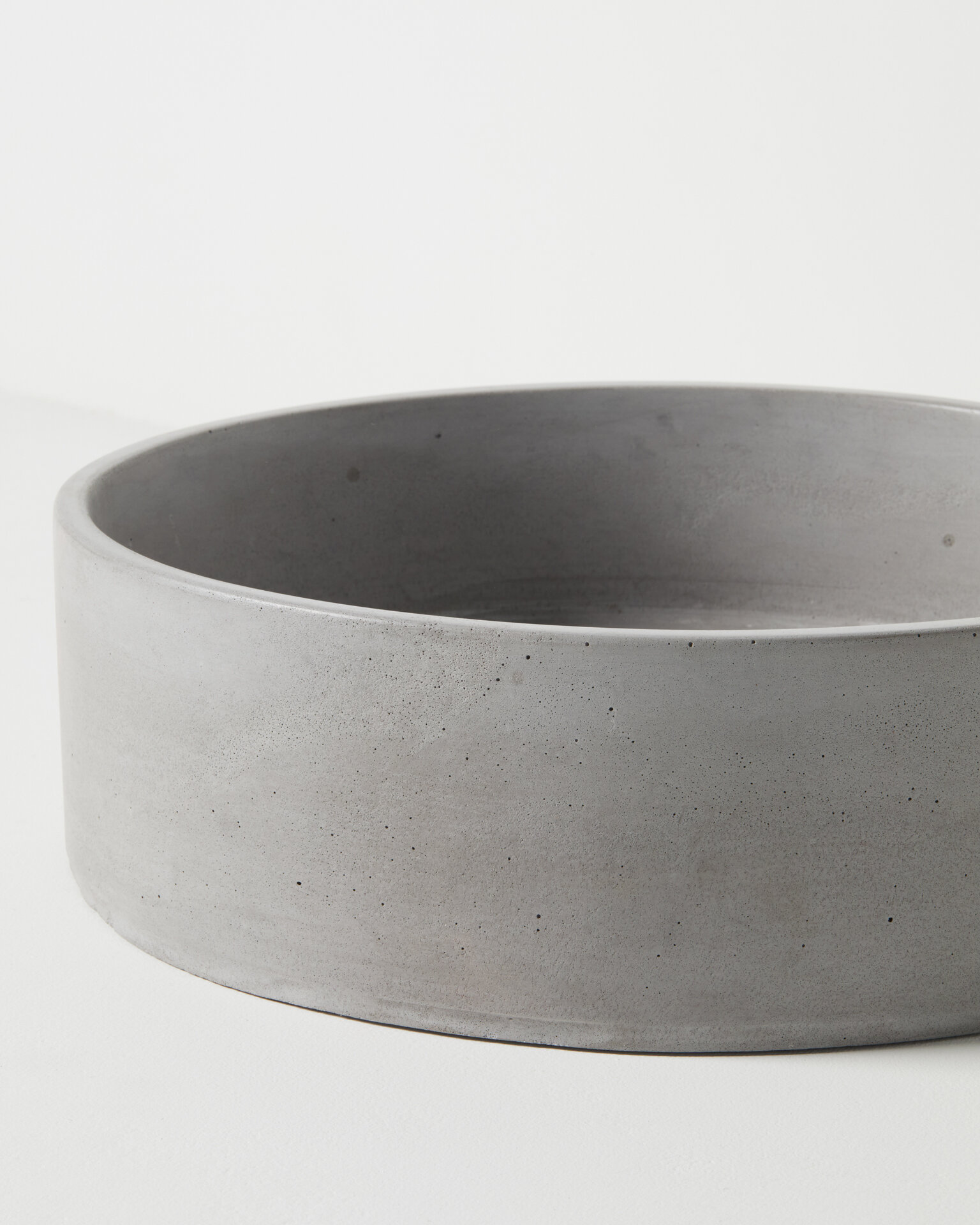
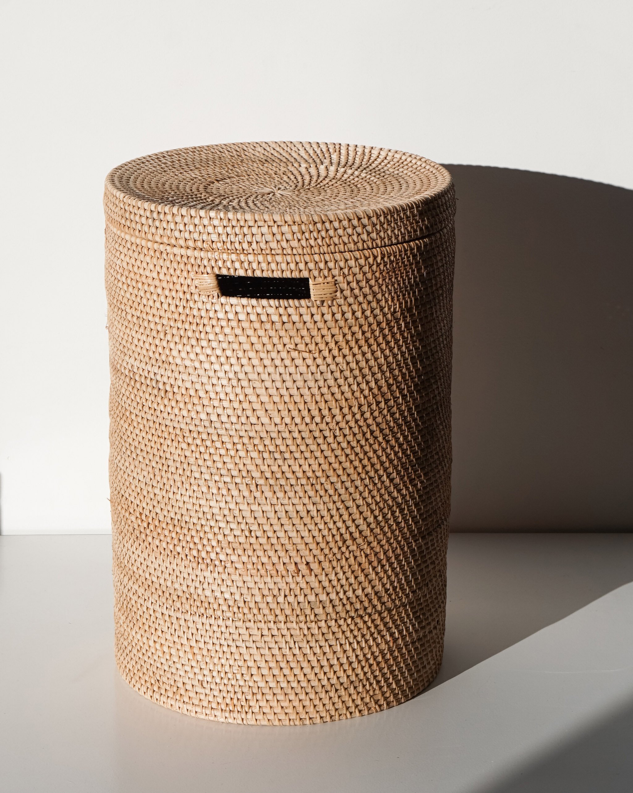
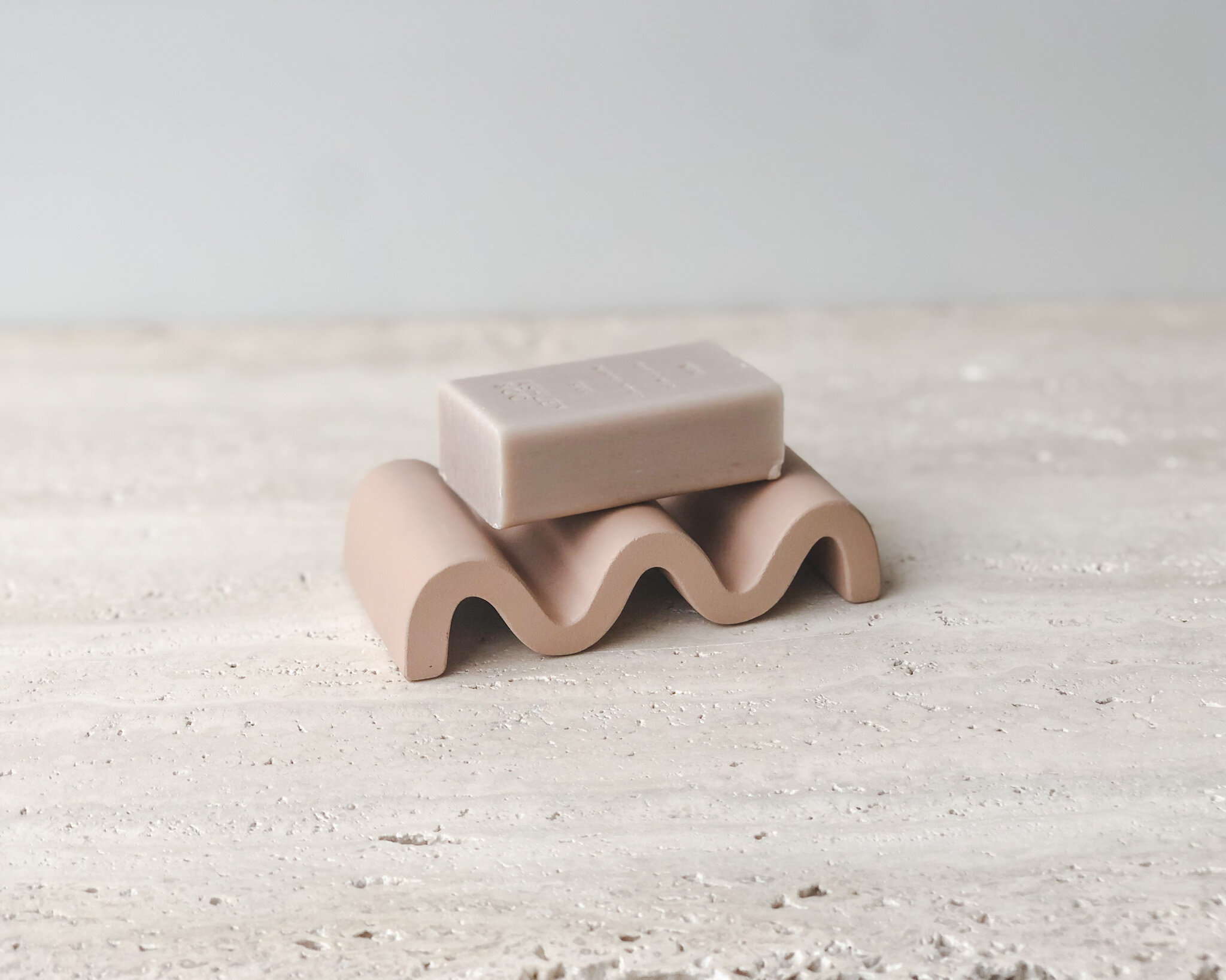
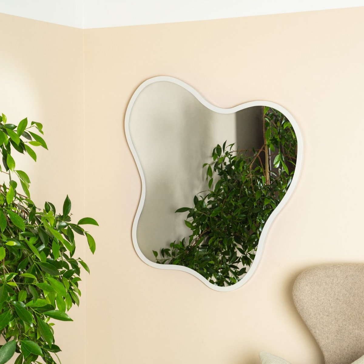
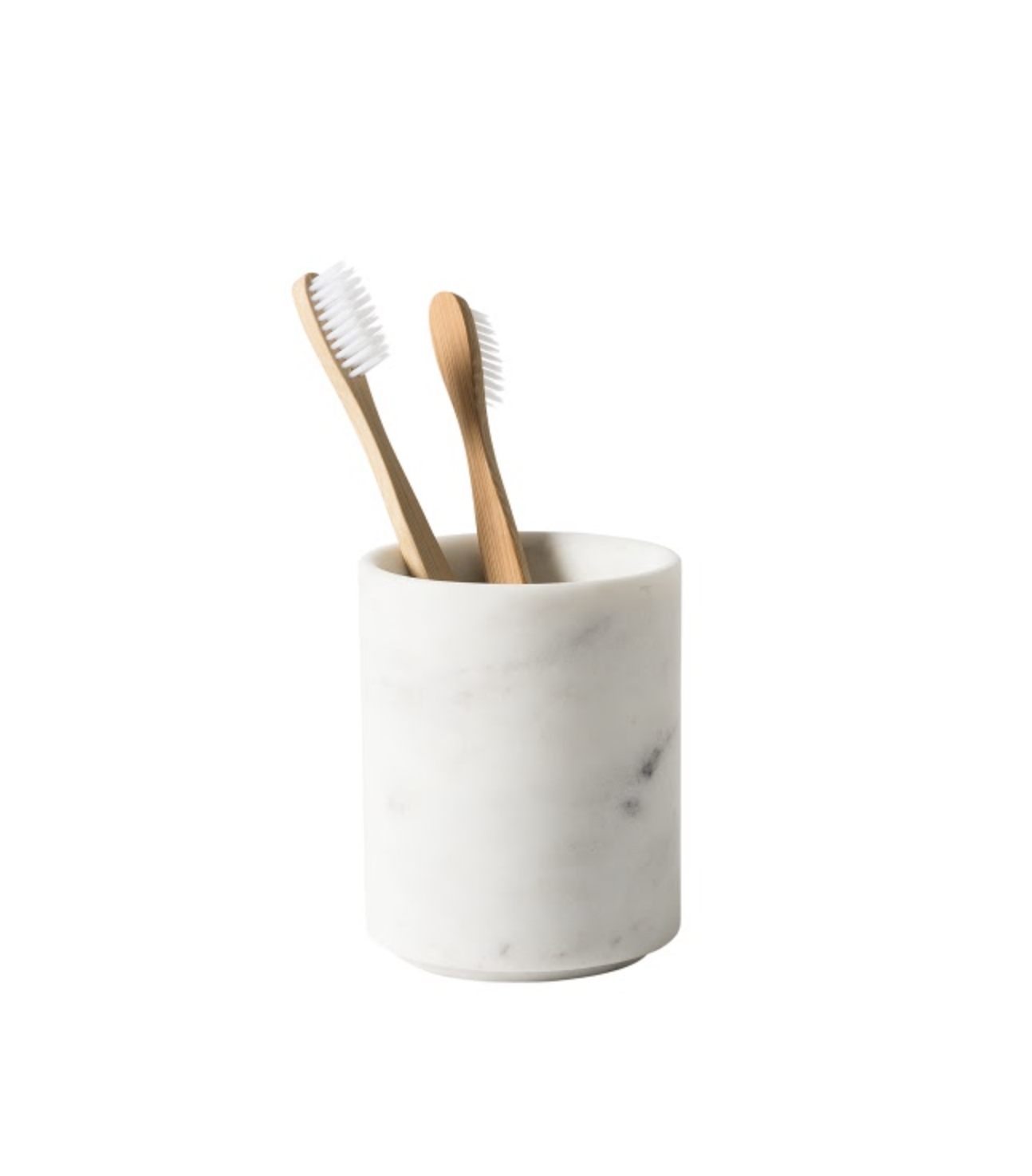
1. Doric bath by MEEK BATHWARE from ARTEDOMUS NZ 2. Towels by BAINA from PAPER PLANE 3. Tapware by ABI INTERIORS 4. Hooks by FERM LIVING from SLOW STORE 5. Acacia basin by TOMORROW’S CONCRETE 6. Laundry basket from BOHÈME HOME 7. Ceramic wave dish from ORNAMENT 8. Blob mirror by MADE OF TOMORROW 9. Ora marble toothbrush holder by CITTÀ
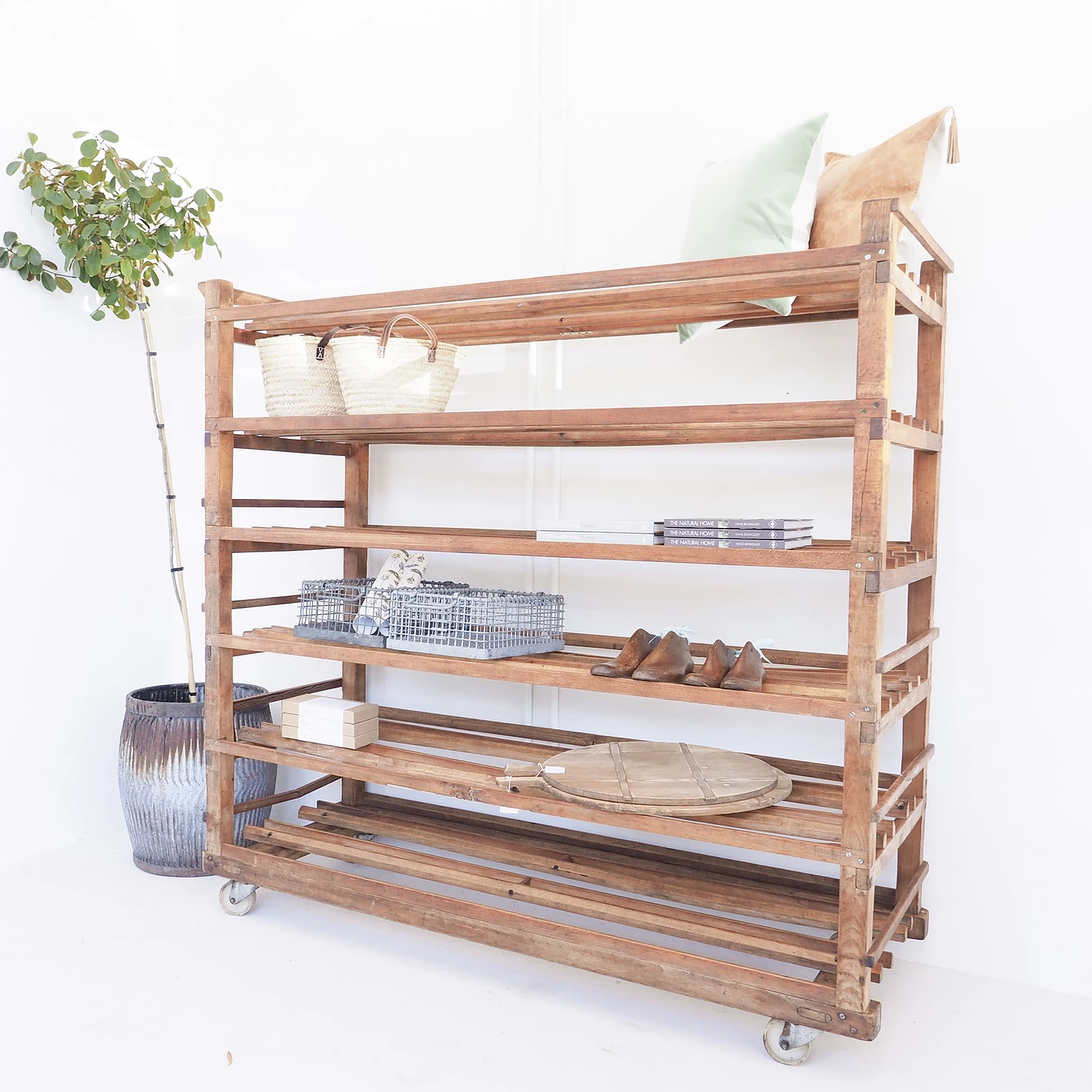
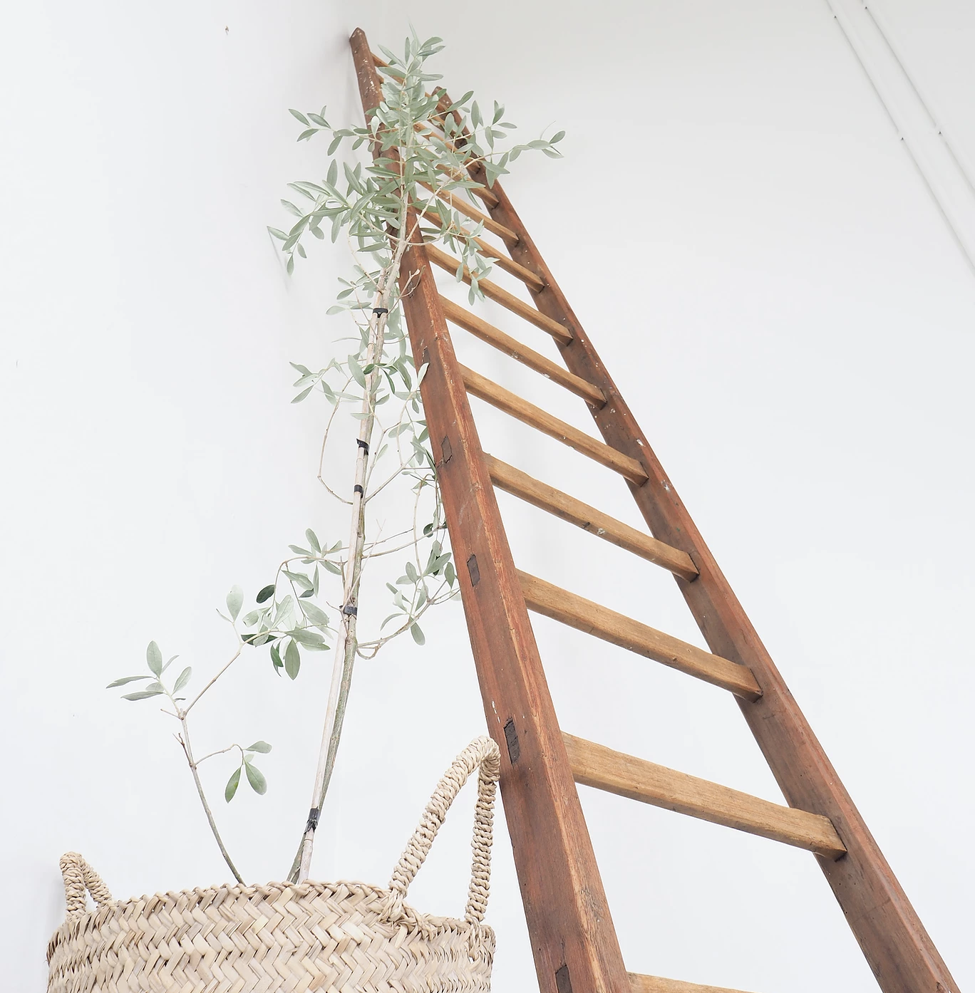
The Sunday Society guide to incorporating vintage furniture into your home
In the latest issue of UNO, we spoke to Kristyn Thomas of The Sunday Society about her love of bringing new life to furniture that might have otherwise been forgotten. Here, she shares her tips on how to incorporate vintage and antique furniture and decor into your home; what to look for, and how to find it.
In the latest issue of UNO, we spoke to Kristyn Thomas of The Sunday Society about her love of bringing new life to furniture that might have otherwise been forgotten. Here, she shares her tips on how to incorporate vintage and antique furniture and decor into your home; what to look for, and how to find it.
UNO: Hi Kristyn! You’ve built a business on having an incredible eye for vintage European furniture; how do you know which pieces to bring home?
Kristyn: My advice is always to buy things that you love. I would never suggest that someone would go out with the intention of trying to achieve a certain look. When you see something you love, even if it isn’t necessarily the look you’re wanting, if you have a reaction to it, that’s what you should build your decor around. People get concerned that things don’t match, but if you step back and look at the whole picture, there will be a look running through it. You usually have similar taste across all items, even if you’re not aware of it. It’s better to fill your home with things you love. If you love it, you can make it work.
Do you stick to a particular era?
I prefer a very layered look from different eras, rather than everything looking so 2020, or so 2015 (or so 1932!). If you’re mixing eras, it really tells a story of your lifetime and experience. It also means you need to update it less. You buy once, and buy quality, keeping pieces that are going to last. It goes beyond what’s in fashion. I have 250-year-old intricate carved French antiques mixed with mid-century eastern European pieces and it kind of works, I love each piece.
For someone that’s never bought any vintage furniture before, where’s a good place to start?
If you’re a bit nervous about incorporating vintage items into your home, you can always start small; choose smaller elements, like an old breadboard in your kitchen for example. It’s a good way to bring that warmth into an otherwise contemporary space. Then you can build up to those big pieces of furniture. I think it helps to think of things in different ways as well - even if it’s something that’s quite industrial, you can use it in a way that is very far away from its original purpose.
And how do you find those special items?
Take the time to wander around, visit different shops that have a range of different things. Whatever speaks to you, ask yourself: what is it about that item? Is it the proportion, the colour, the type of timber? Then try and identify that common thread to help you find more things you like. I’m inspired by a lot of European Instagram accounts, and people that have that European aesthetic I love, like Lynda Gardener. You can use Google Translate to search for what you’re looking for in another language online too!
What has been your most treasured find to date?
In our hallway, we have an amazing set of telegram drawers. It was an online find from about eight years ago - we’d been looking for something for almost ten years prior. I had always kept an eye out. We’d just finished building our house, and definitely had no budget to be buying interesting, fun things. But we saw it, and it was perfect, and we just asked ourselves when we’d ever find it again! It fits perfectly in the space - so sometimes you have to just jump on it. With vintage pieces there is only one - if you want it, you have to get it! Make it work!
What about a favourite find for your store?
One of my favourite things we’ve had in the store recently is a matching pair of twelves drawer units in solid French oak, from an old cotton factory in the North of France. An identical pair - that’s pretty rare!
Read more about The Sunday Society in the latest issue of UNO, or you can visit them at their store in the Matangi Dairy Factory, at THESUNDAYSOCIETY.CO.NZ or on Instagram @THE_SUNDAY_SOCIETY_NZ


